
Ever looked at a design and thought, “Wow, this looks perfect?” We’ve felt the same at certain points. But how do designers create such perfect designs? It isn’t just about creativity. Lots of things play a role here. Every shape, color, and texture play a role in how we perceive a design. The psychology of a design is what gives us chills sometimes.
This happens whenever a designer pays attention to the design elements. But what is unique about these elements of design that affect our design so much? Strong UI/UX design can increase site user conversion rates by almost 200%. So, how do they affect the way we see, feel, and interact with a visual?
In this blog, we’ll explore the 17 elements of design. We’ll see how they affect the viewer. Each of these elements plays a role in creating a masterpiece. Are you ready to level up your design skills to the next level? Let’s begin!
What are the elements of design?
The elements of design work together to create a graphic design. Of course, you can just generally create a design, too. But when you follow the elements of design, your visual turns out different. It looks aesthetic and appealing. It’s able to evoke feelings through the image. And you know when you see a design that takes your eyes in different directions? Those designs are built with the fundamental elements of design in mind.
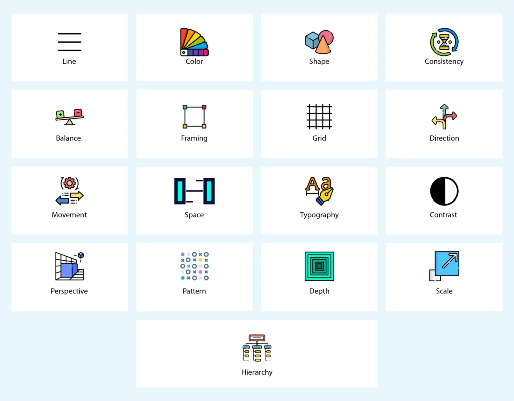
These elements make up the basic structure of a design. When you put time and effort into building the structure, the rest comes out perfectly. Let’s see what these 17 elements of design are:
1. Line
Line is the most essential element in almost every design. Lines make up the structure of a visual. Different kinds of lines send different messages.
Examples
- Horizontal lines create a sense of stability and calm. These lines are often associated with horizons and peacefulness.
- Vertical lines show power and formality. We often see these in building structures and religious architecture. This strengthens and conveys authority and grandeur.
- Zigzag lines make you feel chaos and unpredictability. Think of the last design you saw of an electric bolt. Didn’t it stir a strong emotion inside you?
2. Color
Color is present in every design. Even the black and white ones. It is the art of balancing these colors that impacts the viewer. The designer shows his expertise by an understanding of the color theory.
Examples
- Red, orange, and yellow are warm colors. These colors create a sense of energy and warmth. They’re very helpful when used in designs that aim to stir some passionate action.
- Blue, green, and purple are cool colors. These shades provoke a sense of calm, luxury, and professionalism. This makes it a popular choice for corporate brands and eco-friendly designs.
- Earthy tones like beige and soft greens are widely used in minimalist and organic branding. They are often paired with pastel palettes to give off a dreamy, comforting feel.
3. Shape
When lines connect, they form a shape. Shapes are the building blocks of every graphic design. By creating different shapes, you can form objects. The spacing and balance between them create proper visuals.
Examples
- Geometric shapes have clean lines and symmetry. They create a sense of stability and order. Their simplicity is why they’ve been used in all kinds of designs.
- Organic shapes are hand-drawn, irregular, and free-flowing. They are often inspired by nature and are dynamic. You’ll find them in artsy, eco-friendly designs. This is because they are comforting.
- Symbolic shapes are often connected to culture. These shapes have deep meanings, Including hearts, stars, arrows, and more. They instantly stir emotions based on which shape you choose.
4. Consistency
Consistency is one of the most important elements of design when it comes to recurrence. When you’re a brand posting designs a lot, you need to maintain consistency.
Examples
- Using the same fonts and colors across all materials helps establish a strong brand identity. This visual consistency makes designs more recognizable and easier to navigate.
- Similarly, you should ensure the functional consistency of your design. You’ll do this by making sure that the buttons, navigation, and elements behave the same way across the graphic design system.
- Imagine opening a website on a phone and on a desktop, and they’re both very different. Suspicious, isn’t it? This is why you should create cross-platform consistency to deliver a good experience.
5. Balance
More than an element, balance is one of the principles of design. Balance ensures that the weight of your design isn’t overwhelming and gets conveyed properly.
Examples
- A designer creates symmetrical balance by making mirroring elements. This is by mirroring them on either side of an axis. This balance raises a sense of stability and order.
- Asymmetrical balance is different. Now, instead of mirroring, asymmetry balances elements of various sizes and textures. It aims to create a more dynamic and modern look.
- Want to create a design balance where the attention goes to the center? Go for Radial balance. This is one of the principles of design that create a strong focal area.
6. Framing
Framing is when you strategically use elements to draw attention and focus in a graphic design. It guides the viewer’s eye and shows its importance.
Examples
- When you add elements in the scene itself, such as branches or windows, you enclose the focus point. This method of natural framing guides the viewer’s attention toward an object.
- Border framing is all about outlines and edges. They help organize content and often make it more visually appealing. Designers often use them in print designs and UI layouts.
- Typographic Framing is a fun way to deliver information. You can place text within shapes to show clarity. This is effective in advertising and editorial design to separate and highlight some messages.
7. Grid
How do designers align things perfectly in a blank space? They do this with the help of grids. These grids are present on a blank surface.
Examples
- Imagine a design where the text is all scattered and doesn’t make sense. Viewers will leave immediately. This is where manuscript grids help. With their help, you can align text perfectly.
- Modular grids are flexible structures made of rows and columns. They divide a page into smaller modules. This type is best for complex layouts, such as dashboards and e-commerce sites.
- Column grids are the most common type. You may have seen these on your phone’s camera app, too. These grids are vertical structures that divide content into multiple columns. It helps make content more engaging and scannable.
8. Direction
Direction is one of the powerful elements of design. The human eye naturally follows directions. When used logically, they can be very powerful.
Examples
- Horizontal directions are often associated with calmness and reading flow. It’s commonly used in landscapes to create a natural and relaxing experience.
- Vertical directions represent strength and growth. They often take the attention upwards. This scene evokes a sense of power and inspiration.
- When you want action and energy, you go for a Diagonal direction. Diagonal lines create are dramatic and creative. You’ll often find them in modern layouts.
9. Movement
Showing movement in idle designs is tricky but not impossible. This is done through the use of subtle or major effects.
Examples
- Dynamic lines and shapes naturally move the eyes in certain directions. This helps create a sense of motion and energy.
- Repeating objects and shapes often create a rhythm. This rhythm suggests movement and feels soothing to the eyes.
- How else can you make static designs feel more dynamic? You can add blur and motion effects. This transparency can simulate motion.
10. Space
The area between and around design components is space. Balancing this space properly by not making it feel too full or empty is an art.
Examples
- Negative space is the empty areas around and between elements. This helps us improve the readability and focus. Minimalist designs use negative space creatively. It helps them add depth.
- On the contrary, positive space is the area where design elements take. This involves text, images, and shapes. When you balance positive and negative space, it looks nice.
- Intentionally using white space creates a sense of elegance, simplicity, and readability. Luxury brands and minimalist websites often use whitespace to feel clean and refined.
11. Typography
Typography is all about the text. The size, colors, and font you use make up the typography of a design or website.
Examples
- Your font type matters a lot. When you’re creating a design that has text. Different fonts evoke different emotions.
- Slightly varying font size matters. When you ensure the weight and spacing of text, it gives better readability.
- You can enhance the typography by using bold and italic variations. The more accessible your typography is, the more users will like it.
12. Contrast
Contrast is when you put opposites together to complement each other. The approach in this element of design makes one or more elements pop out and look cool.
Examples
- The most common kind of contrast is using light and dark colors. Think of designing a sunset. You’ll use contrasting light and dark shades of orange and yellow.
- You can convey contrast through text and image sizes, too. This way, you can create emphasis in layouts.
- You can use entirely opposing colors together to create depth. Some examples can be black and white, orange and blue.
13. Perspective
Perspective is more than one of the elements of design. It’s also one of the principles of design. It helps create depth and realism in a graphic design.
Examples
- Linear perspective uses vanishing points to create depth and realistic looks. A one-point perspective example can be a road disappearing into the horizon. This will add structure and realism to designs.
- Atmospheric perspective makes objects appear lighter and less detailed. They are more faded as they recede into the background. They mimic how the eye perceives distance.
- Oppositely, forced perspective manipulates the placement to create optical illusions. This technique makes objects appear larger or smaller than they are. This delivers a sense of surrealism.
14. Pattern
Repeating elements create visual interest in a design. The human brain loves recognizing patterns. They’re often structured in an organic way.
Examples
- Repeating shapes like perfect squares, circles, or triangles creates a sense of order and symmetry. These geometric patterns stir a sense of perfectionism.
- Organic patterns, on the other hand, are inspired by nature. These patterns feature irregular, flowing forms like waves and animal prints. They evoke warmth and movement.
- Want to create patterns of your own? Abstract Patterns are the way to go! They are less structured and more experimental. These patterns use unique shapes, lines, and colors to create dynamic visuals.
15. Depth
Simple and static designs have their own place, too. But adding depth to images is just amazing. Depth can make designs look like they’re popping right out of the screen.
Examples
- Overlapping elements often create a sense of depth. By combining them with fading and enhancing elements, you would be able to add depth.
- You can also add depth by adding shadows and highlights. They mimic realistic lightning. By adjusting the focus on an object, you can add depth.
16. Scale
One of the elements of design that looks at the sizing of objects and shapes is scaling. It has the power to bring logic and meaning to an object or even take it away.
Examples
- Scaling objects often means creating differences in emphasis. Larger shapes will take away more of the attention. But too many large shapes can be overwhelming.
- Maintaining a balance between scaling elements creates visual harmony. You can create dynamic and dramatic effects.
- Add depth and perspective here if you want to scale with an impact. This type of approach creates a three-dimensional look.
17. Hierarchy
Hierarchy is meant to organize design elements on a visual based on their importance. This helps create a structured flow.
Examples
- Larger elements draw attention quickly and easily. Whatever you want to bring attention to, you can make its size bigger.
- Where you position elements play a big role. Some can be placed higher and some lower; wherever you place them, it distributes the attention.
- When conveying text through designs, you can use different font styles and sizes. Bigger, bolder fonts are used for the main headings, and smaller natural fonts are used for the secondary information.
Wrapping it up
You now know the 17 elements of design. They can help you create the perfect design. This is if you master how to use them logically and balance them. A graphic design has the power to convey a lot of emotion. On average, every dollar businesses invest in UX brings $100 in return, too. However, this is only when the UX designer is someone who understands the elements of design.
At Linkitsoft, our UI/UX designers ensure that they follow these design elements. This helps them create impacting, flowing designs that resonate with your company. Contact us today if you want an intuitive and navigable website or app design. Waiting around won’t benefit you, but taking the help of our expert designers will!


