
Back in 2008, Dropbox had a problem. Their file-syncing tech was amazing, but trying to explain it? A nightmare.
Instead of throwing a wall of text at confused users, they did something genius—they made a simple, engaging explainer video. Just a short clip, but it worked like magic. Suddenly, people got it. Sign-ups shot up by 10%, and that little video helped propel Dropbox into the giant it is today.
Now, imagine this. You’ve spent months working on a project management SaaS application. You launch with a bang—a big promotion and a slew of sign-ups. Everything is fine. Then, reality hits. People start leaving feedback such as: “The onboarding process is confusing,” “I can’t locate half the features,” and “This thing is slowing me down instead of helping me.” And before you know it, your hard-fought users vanish.
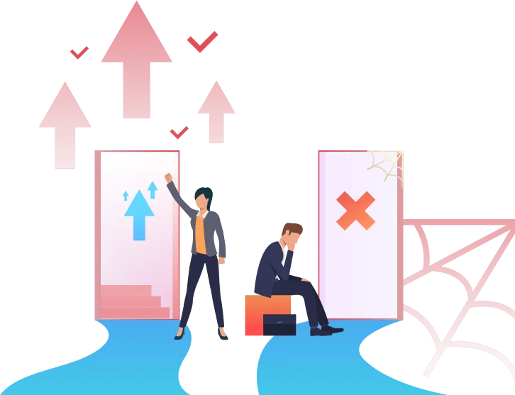
Here’s the thing: UX isn’t about making things pretty. It’s the key to user retention, churn reduction, and, yes, actual revenue growth. If you’re in SaaS, unless your product is intuitive and easy to use, people will leave. Bad UX is a silent assassin. It frustrates users, conceals valuable features, and turns your dream product into a tool people don’t want to use. So, doing UX right from day one is not optional.
So, whether you are starting a brand new SaaS product or transforming an existing one, these 19 principles are your formula for success. Do them right, and you’re not simply creating a working product—you’re creating something that people love to use.
Why Great SaaS UX Design Can Make or Break Your Business
Exceptional SaaS UX design is not a nice-to-have—it is what differentiates a product that people love from one that people leave in frustration. A clunky, frustrating interface is a one-way ticket to losing customers.
Suppose you’ve just downloaded a new recipe app and can’t wait to prepare something amazing. Unfortunately, the app is a nightmare. Ingredients are buried in menus that don’t relate to each other, and navigation is a puzzle to be solved. After a mere five minutes, you uninstall and give up. This alone is a reason UX design matters.
In SaaS, all small interactions have an impact on your bottom line. A smooth, intuitive experience doesn’t just look good—it feels good. And when users can easily do things, they stay. They progress from casual users to committed customers.
Take Netflix, for example. If finding your next binge show was a hassle, you’d switch to a competing service in a heartbeat. But Netflix nails UX—they keep browsing simple, give you smart recs, and stream smoothly.
And what do you know happens? Customers don’t leave, engagement is high, and revenue grows and grows.
The point is that good UX is not just about aesthetics. It is making your product intuitive enough that users don’t have to think consciously about using it—they just do. Do UX well, and you’re not just improving design. You’re making an investment in enduring success.
Section 1: Foundational Principles
Before we talk about design, we must understand the users. Good design starts with knowing what people need and how they behave.
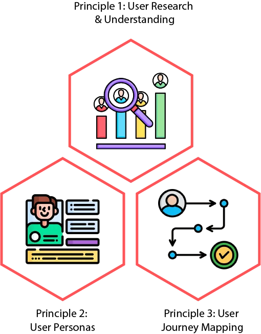
Principle 1: User Research & Understanding
SaaS design must focus on users. You are not making the product for yourself. Users have goals, problems, and needs. If you don’t understand them, your product may fail. People will feel frustrated and leave. Research helps you create a smooth and easy-to-use design.
How To Do User Research
There are many ways to learn about users:
- Surveys– Ask people questions. Learn about their age, job, and habits.
- Interviews– Talk to users. Find out what they like, dislike, and expect.
- Analytics– Use tools like Google Analytics. See how people move through your site.
Understanding User Needs, Goals, and Pain Points
- User Needs– Find out what problems users solve with your product.
- User Goals– Make sure your product helps them save time and work better.
- User Pain Points– Fix things that make users upset. A smooth experience keeps them happy.
Good research helps create simple, helpful, and enjoyable products.
Principle 2: User Personas
Personas are fake profiles that represent real users. They help designers understand different user types. A persona includes:
- Demographics– Age, job, location
- Goals– What they want to achieve
- Frustrations– What bothers them about other tools
- Habits– How they use technology
For example, a project manager may care about speed, while a team member may want clarity.
Why Personas Help
Personas help you design better. They allow you to:
- Think Like a User– Understand their needs.
- Decide Features– Focus on what matters most.
- Improve Workflows– Make tasks easier.
- Stay Consistent– Keep the design user-focused.
Using personas makes the design process clear and effective.
Principle 3: User Journey Mapping
A user journey shows every step a person takes with your product. It helps designers see the full experience from start to finish. It includes:
- User Actions– What they do
- Touchpoints– Where they interact with your product
- Thoughts and Emotions– How they feel at each step
- Pain Points– Where they struggle
How Journey Maps Improve Design
- See the Big Picture– Understand the whole user flow.
- Fix Problems– Remove roadblocks that slow users down.
- Make Navigation Easy– Guide users smoothly.
- Improve Onboarding– Help new users get started fast.
Mapping user journeys makes the product simple, smooth, and frustration-free.
Section 2: Core UX Design Principles
Once you know your users, you can design better. These principles help make SaaS products simple and easy to use.
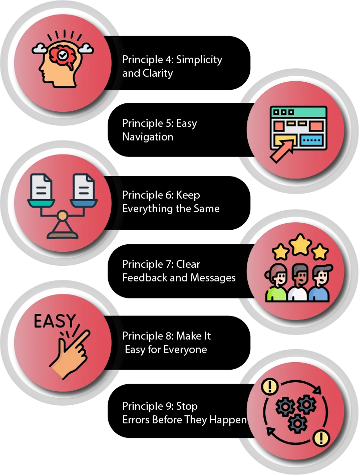
Principle 4: Simplicity and Clarity
Good design is simple. People should not feel lost when using your product. A messy design is confusing. A clean design helps people find what they need fast.
Focus on What Matters
Too many features can be overwhelming. Keep only what is important. Here’s how:
- Less Clutter– Use space well.
- Simple Words– Avoid hard words.
- Highlight Key Actions– Guide users to what they need.
- Show Features When Needed– Don’t overload users.
- Use Visuals Smartly– Make the layout easy to follow.
A simple, clear design makes users happy. They get things done quickly and enjoy the experience.
By following these principles, SaaS products become user-friendly, easy to use, and enjoyable.
Principle 5: Easy Navigation
Users should move through your SaaS product without trouble. A good design makes this easy. A clear layout helps users find what they need fast.
- User-Friendly Layout: Design menus based on how people think. Use research like card sorting to understand them.
- Same Navigation Everywhere: Keep menus in the same place on every page.
- Search & Breadcrumbs: Let users search and see their path in the app.
When users can move around easily, they stay longer and get things done faster.
Principle 6: Keep Everything the Same
A steady design makes it easy to learn and use. When everything looks and works the same way, users feel comfortable.
- Same Colors and Fonts: Use the same colors, text styles, and buttons.
- Same Actions: Keep button styles and movements the same everywhere.
- Same Words: Use the same words for features and messages.
When things are the same, users trust the app. They also learn faster and work better.
Principle 7: Clear Feedback and Messages
Users need to know when they do something right or wrong. Good feedback helps them understand what’s happening.
- Show Changes: Use small effects, loading bars, and success messages.
- Offer help with Errors: Show prominent error messages and provide information on how to fix them.
- Useful Tips: Make alerts short, meaningful, and easy to edit.
- Through open feedback, users are empowered and in control.
Principle 8: Make It Easy for Everyone
A good design is usable for all users, regardless of whether or not they have disabilities. Follow guidelines to allow all to use the app.
- Easy to Read: Use big font size, high contrast, and simple fonts.
- Easy to Use: Allow keyboard shortcuts and assistive tools.
- Test for Everyone: Get feedback from different users.
An inclusive design helps more people and makes your product better.
Principle 9: Stop Errors Before They Happen
Mistakes slow users down. Design can prevent many errors before they happen.
- Give Clear Directions: Use simple labels and hints.
- Check Inputs: Stop wrong entries with smart rules.
- Confirm Important Actions: Ask before deleting or making big changes.
- Use Smart Defaults: Fill in common answers to save time.
- Show Helpful Tips: Give guidance when needed.
Even with these steps, errors still happen. When they do, make it easy to fix them.
- Simple Error Messages: Avoid complex words.
- Explain the Problem: Tell users what went wrong and why.
- Give Solutions: Show steps to fix it.
- Use Kind Words: Be supportive and friendly.
- Let Users Undo: Give them an easy way to go back.
Effective error handling provides users with a sense of security and control.
Section 3: Engagement and User Delight Principles
By focusing on engagement and user delight principles in the following steps, your saas application will be easy to use, intuitive to navigate, and delightful for all to use.
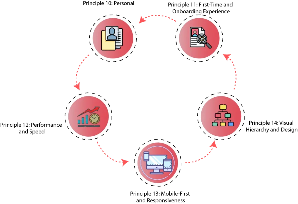
Principle 10: Personal
Personalization strengthens SaaS products. It is tailored to address user needs. This provides users with the feeling of being at home. Some strategies are:
- Customisation: It is possible to customize themes, layouts, and dashboards.
- Configurability: Allows users to customize workflows.
- Customized Content: Recommends based on user behavior.
- Role-based Features: Presents features based on user role.
Personalization has several benefits:
- Increased Engagement: More time is spent.
- Better Satisfaction: People like personalized experiences.
- Increased efficiency: Time and energy saved.
- Greater Loyalty: They have a sense of attachment to the product.
Effective UX design makes software more user-friendly. It creates a smooth experience for everyone.
Principle 11: First-Time and Onboarding Experience
A good start is crucial. New users learn from onboarding. A structured process guarantees:
Simple Steps: Focuses on the basics
- Feature Highlights: Presents significant features in advance.
- Guided Tutorials: Uses pop-ups, tooltips, and videos.
- Contextual Aid: Offers instant aid.
- Tailored experience: Scales to suit every user’s needs.
Key onboarding elements
- Easy Sign-Up: Fast and simple registration.
- Welcome Message: Gets the tone right.
- Interactive Guides: Facilitates learning through doing.
- Indicators for progress: Inspire users.
- Help Centre: More support.
A well-designed onboarding process retains users. It leaves them with a positive feeling and satisfaction with the product.
Principle 12: Performance and Speed
Speed matters. Slow apps frustrate users. To improve performance:
- Optimized code: Quicker response times.
- Enhanced Media Management: Scales down images.
- Smart Caching: It reduces server load.
- Content Delivery Networks (CDN): Speeds up access.
- Fewer HTTP Requests: Boosts efficiency.
A fast app improves:
- User Satisfaction: Happy users stay longer.
- Productivity: Smooth workflow.
- Bounce Rates: Fewer users leave.
- SEO Rankings: Higher visibility.
- Brand Trust: Reliable performance builds reputation.
Focusing on speed ensures a great user experience. It keeps people coming back.
Principle 13: Mobile-First and Responsiveness
SaaS apps must work on all devices. A mobile-first design helps. It starts with small screens and scales up. Responsive design adapts to different screens. Key strategies include
- Mobile-First: Design for phones first.
- Flexible Layouts: Uses grids and media queries.
- Touch-Friendly UI: Easy tap and swipe actions.
- Optimized Performance: Fast on all devices.
- Cross-Device Testing: Ensures smooth use everywhere.
Benefits include wider reach, better user experience, and higher engagement. A good mobile design makes SaaS products future-ready.
Principle 14: Visual Hierarchy and Design
Good design helps users find what they need. It makes key elements stand out. A strong visual hierarchy improves user experience. It uses contrast, colors, fonts, and spacing.
A great design:
- Improves Usability: Easy to read and navigate.
- Boosts Engagement: Attractive interfaces keep users interested.
- Builds Trust: Professional designs feel reliable.
- Shows Brand Identity: Consistent colors and fonts reinforce branding.
Key design elements include contrast, color, typography, whitespace, spacing, and icons. A clean, structured design makes SaaS apps look and feel better.
Section 4: Iteration and Improvement Principles
SaaS UX design is always changing. To keep up, we must test, collect feedback, and analyze data. A SaaS app must evolve to meet user needs. A constant improvement cycle keeps the user experience smooth and enjoyable.
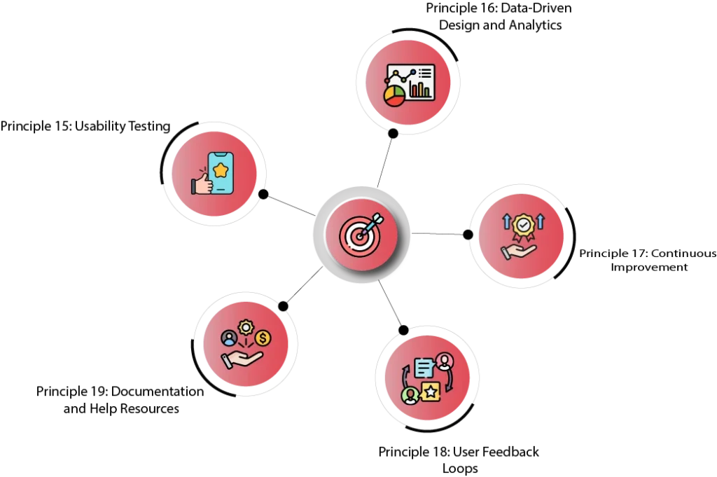
Principle 15: Usability Testing
Usability testing helps spot problems and refine the user experience. Different UX research methods help understand real user struggles.
How to Involve Real Users in Testing:
- Task-Based Scenarios: Simulate real-life tasks to see how users interact.
- Observation: Watch user behavior and note patterns.
- Think-Aloud Protocol: Ask users to describe their thoughts as they navigate.
- Data Collection: Use both numbers and user opinions to improve.
There are several ways to conduct testing, including:
- Moderated Testing: A researcher guides users through tasks.
- Unmoderated Testing: Users test the app on their own.
- In-Person Testing: Observe users face-to-face.
- Remote Testing: Users participate from different locations.
Recurring testing refines the design of the app, enhancing user experience.
Principle 16: Data-Driven Design and Analytics
Monitoring user data sharpens SaaS UX design. Engagement, conversion rates, and navigation patterns are analyzed to find weak spots.
Key Indicators to Follow
- User Engagement: Time on site and what features are being used.
- Conversion Rates: How many users register or complete tasks?
- Churn Rates: Why users leave or stop using the product.
- Error Rates: Rate in which users experience problems.
- Navigation Paths: User pathways in the app.
With the use of analytics tools like Google Analytics and Mixpanel, businesses can set goals, track progress, and make design decisions. Data-informed decision making optimizes SaaS UX design and enhances user experience.
Principle 17: Continuous Improvement
To remain in front, SaaS UX design has to continuously improve. User expectations change, and thus constant updates are necessary.
Ways to Keep UX Fresh:
- Review UX Regularly: Study feedback and analyze app structure.
- Follow UX Trends: Read industry blogs and attend events.
- Use an Iterative Design Process: Test and tweak at every stage.
- Try New Ideas: Experiment with creative design strategies.
- Learn from Mistakes: Fix usability problems as they arise.
Staying Updated with UX Best Practices:
- Follow UX blogs and experts.
- Attend UX conferences and workshops.
- Analyze competitors’ UX approaches.
- Monitor user feedback.
- Share UX knowledge within the team.
A continuous improvement mindset keeps SaaS products competitive and user-friendly.
Principle 18: User Feedback Loops
Good feedback loops improve SaaS UX design. Listening to users leads to better decisions.
How to Collect and Use Feedback:
- In-App Feedback Forms: Let users share thoughts while using the app.
- Surveys: Get targeted insights from users.
- User Interviews & Focus Groups: Gather detailed opinions.
- Customer Support Channels: Review user complaints for design improvements.
- Social Media & Online Communities: Track user discussions.
- App Store Reviews: Identify common problems.
Key Steps to Make Feedback Useful:
- Listen to what users say.
- Prioritize the most important feedback.
- Respond to concerns.
- Make improvements based on feedback.
- Let users know their input led to changes.
Effective feedback loops ensure that SaaS UX design stays user-centered and is always improving.
Principle 19: Documentation and Help Resources
Even with a great app structure, users need support. A well-organized help system reduces frustration and lowers support requests.
How to Empower Users to Solve Problems Themselves:
- In-App Help Center: Offer built-in guidance.
- Contextual Help: Provide tooltips and pop-ups for quick tips.
- Knowledge Base: Create FAQs and articles for easy reference.
- Video Tutorials: Use visuals to make learning easier.
- Onboarding Documentation: Help new users get started smoothly.
- API Documentation: Give developers clear technical guidance (if needed).
What Makes Help Resources Effective?
- Up-to-date and complete information.
- Simple and clear language.
- Easy search and navigation.
- Accessible on different devices.
- Available in multiple formats (text, video, etc.).
Effective self-help resources enhance SaaS UX design by making it possible for users to solve problems independently.
By adhering to these principles, SaaS UX design is effective, intuitive, and continuously improving. Small incremental changes keep the experience fresh and interesting.
Don’t Let Poor UX Hold You Back – Choose Linkitsoft for SaaS Success
SaaS UX is a continuous process. By embracing 19 principles from user research and journey mapping to simplicity and consistency, and from personalization to mobile-first design, you create a differentiated product. With usability testing, data-informed design, and feedback loops, your SaaS is always user-focused and responsive to user demands.
Poor user experience in today’s SaaS economy can hurt your business. It can lead to unhappy users, high churn rates, and revenue loss. While your competition is improving their platforms and winning customers, you can’t afford to lag behind. Invest in high-quality saas UX design today.
At Linkitsoft, we create saas UX that delights and engages users. We do this in a straightforward and effective manner:
- We use UX research to learn what users need.
- We believe in following good UX design principles like consistency and clarity.
- We use features like personalization in an attempt to maximize engagement.
Good design is not necessarily about looks—it’s about functionality. Information Architecture (IA) in UX is a significant contributor to making your site usable. If users can find what they need quickly and easily, they will spend more time on your site and visit more often.
You can turn your SaaS product into something that is loved by users. We simplify your platform and make it seamless and effortless to use. With good design, you will see better user retention, greater satisfaction, and sustainable growth.
Don’t wait until you fall behind. Contact us today and have Linkitsoft assist you in staying in front with the best saas ux design.


