
Imagine landing on a webpage where everything feels perfect. The images are centered, the text is evenly spaced, and navigation is smoother than butter. There’s no clutter, no distractions, just a clean, structured layout that guides you naturally. Thanks to this, it feels premium, trustworthy, and easy to navigate.
One such example is on Apple’s product pages. They show the true power of symmetry and how balance can create a sense of luxury. But is symmetry really always the best choice? Or is asymmetry capable of creating an even more engaging experience? We’ll learn this in our blog.
Let’s explore how symmetrical vs asymmetrical shapes affect design. Let’s discover how to strike the right balance between order and creativity!
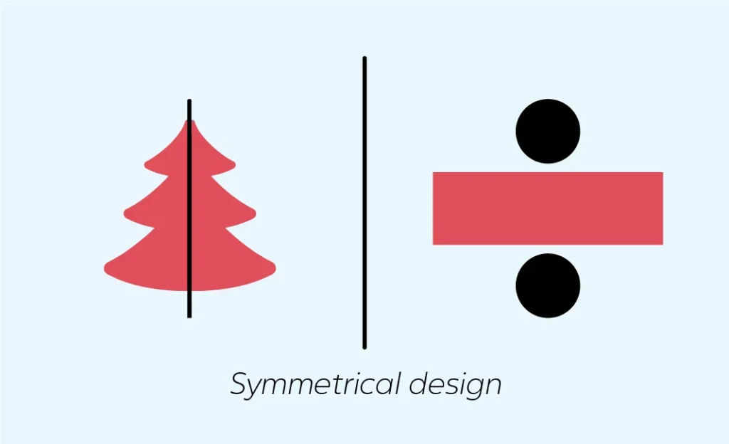
What is Symmetrical design?
Symmetrical designs are patterns that mirror each other. Think of a butterfly and how perfectly its wings mirror each other. In design, symmetry means creating visuals where elements on one side of an axis are reflecting or repeating on the other side of the axis. This creates a sense of order and harmony.
What are the characteristics of Symmetrical Design?
In symmetrical vs asymmetrical designs, Symmetrical designs have these few characteristics that are always common regardless of the shape of the object. They are:
- Symmetric objects and designs have one side that is exactly similar to the other.
- These designs look the same even after you rotate or reflect them.
- Symmetric designs are perfectly balanced on both sides of the axis. So, they produce a sense of harmony and order.
Think of a circle or a square. They are perfectly symmetric. They’ll remain the same even if you rotate them or reflect them. It makes them the perfect examples of symmetric shapes.
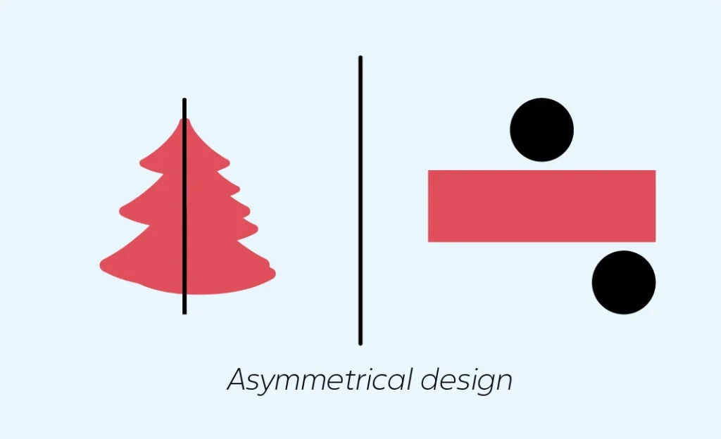
What is Asymmetrical design?
Have you ever arranged elements unevenly, and they actually looked good instead of bad? This contrast in shape is called asymmetric design. Asymmetric design shows us that imbalance and variation can be appealing, too. They don’t have balance from any side of the axis or center point. This creates a sense of creativity and chaos.
What are the characteristics of Asymmetrical Design?
In symmetrical vs asymmetrical designs, asymmetrical designs can have varying characteristics. This is because asymmetry can consist of various shapes and sizes, even in the same design.
- They are never equal. This unevenness is what creates a sense of visual interest.
- Asymmetric designs can look lively and engaging because of their irregularity. This makes them a popular choice in the tech industry.
- Asymmetry can emphasize the use of contrast. This can include contrast in shapes, sizes, and colors.
Think about clouds or rocks. It’s very rare to find them equally balanced. Their unique imbalance gives them a unique beauty. It makes them the perfect examples of asymmetric shapes.
What are the types of symmetries?
There are some further types of symmetrical vs asymmetrical designs. In the software tech industry, these design styles can have a considerable impact on the user experience. Both design styles have the ability to evoke emotions in individuals. Let’s understand the different types so you can use them in your website layouts and product design workflow:
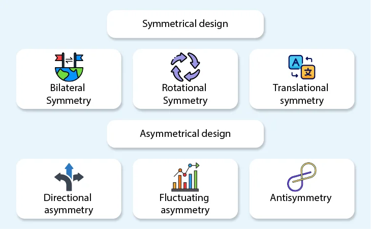
Symmetrical design
Symmetrical designs are always balanced, creating a sense of professionalism. Let’s see the three types of symmetrical design:
Bilateral Symmetry
Think of a rectangle. Rectangles are always equal from their center point. So, bilateral symmetry is when the right and left sides of an object are mirror images of each other.
The easiest example can be to look at a human. The right side and left side of the human body are almost equal from the central point.
Rotational Symmetry
What happens when you rotate a ball? Does it change shape? No, a ball will remain the same no matter which direction you rotate it in. This is what rotational symmetry is about.
Mostly, rotational symmetry is possible with geometric shapes. So another example can be a hexagon. No matter how much you rotate it, it will keep looking the same.
Translational symmetry
Translational symmetry follows a pattern. You can often find them in wallpapers. Think of a wallpaper with stars. The stars would be the exact same shape and spaced out evenly.
A beehive is an excellent example of translational symmetry. Just think of how appealing a beehive looks because of its hexagonal pattern.
Symmetric designs look elegant because of their perfection. This is why they are often seen in a product design workflow. In symmetrical vs asymmetrical designs, brands often use symmetric ones.
Asymmetrical design
Symmetric designs convey creativity and energy through imbalance. This creates a sense of interest and movement. Let’s see three types of asymmetrical design:
Directional asymmetry
Directional asymmetry follows a pattern, yet it’s asymmetric. Both the left and right sides in this type of asymmetry are consistent, but still, it’s predictable.
Think about a snail’s shell. The way it spirals and still follows a direction is a beautiful example of directional asymmetry.
Fluctuating asymmetry
Fluctuating asymmetry is usually just a bit of an imbalance in the symmetry of an object. This symmetry focuses on the small and random differences of an object.
A simple example would be the slight facial imbalances found on either side of a face. This type of design can be used creatively in a website layout or app design.
Antisymmetry
Antisymmetry is when elements are intentionally mirrored, but they are opposite in nature. It follows a structured approach that’s often contrasting.
The yin-yang symbol conveys antisymmetry perfectly. It creates a sense of deliberate imbalance by merging two different objects that are opposite to each other.
How do you find the right balance?
In graphic design, businesses often try to strike a balance between symmetry. This helps them create an approach that helps them stand out from their competitors. It happens because of uniqueness. Let’s understand how you can find the right balance between both and create eye-catching designs:
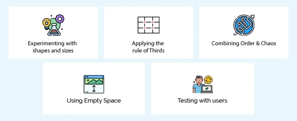
Experimenting with shapes and sizes
Explore styles with different shapes and element placements. Try to combine symmetrical shapes with asymmetrical ones on a website layout. Balance them out by keeping the shapes same on the upper part of the page. At the same time, you can create a difference in the layout by making them slightly different on the lower part.
For example, you can combine large, bold text around smaller and subtle elements. This can create an engaging structure.
Applying the rule of Thirds
Everything doesn’t need to be centered. You can always experiment by dividing your layout into three equal parts. Then, you can place the key elements at the intersections. This way, you can create directional asymmetry, too. This can help create balance and a sense of predictability. If your users like it, it will improve the user experience.
This design style keeps the layout dynamic while maintaining visual balance. This might be able to get your website visitor hooked.
Combining Order & Chaos
Why not combine both symmetrical vs asymmetrical designs in the same layout? Of course, this is possible, but with the help of an experienced designer. This balance can either increase your conversions or take your website traffic down. The key is to create a subtle balance without overwhelming the user.
The structural areas can have symmetry. You can use it for headers and navigation. On the other hand, you can use asymmetry for eye-catching sections. The best place to use it is on a CTA.
Using Empty Space
When combining symmetrical vs asymmetrical designs, using empty space can be very useful. When using these designs, it’s easy to overwhelm the user accidentally. They have different preferences. Some are hooked at perfect balances, and some find interest in imbalances. This is why using empty space can help.
Negative space helps balance out asymmetrical layouts. This is by providing breathing room that guides the viewer’s eye naturally.
Testing with users
In the software industry, doubt isn’t something that you can take lightly. It gets expensive the more lightly you take it. Instead, what can help most is testing. When you’re designing a website layout or product design workflows, your priority should be your users. What’s better than testing with them?
Testing your layout with real users can help determine the balance. It can help understand how symmetrical vs asymmetrical enhances clarity and engagement.
When to Use Symmetrical Design
You have a website or app. You want to design their product design workflows. Naturally, you’d also want to balance the asymmetrical vs symmetric elements there. But how will you know when to use which? Let’s see:
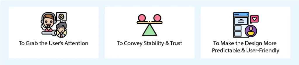
To Grab the User’s Attention
Order and harmony naturally grab anyone’s attention. It’s about the subtle connection it instantly creates with the user. Due to its familiarity and elegance, it subconsciously helps the user feel at ease.
To Convey Stability & Trust
Think of a banking and finance app. You’ve almost never seen asymmetry there. This is because banking apps need to convey trust and reliability. The use of symmetry here assures users that they are in a well-structured environment.
To Make the Design More Predictable & User-Friendly
symmetrical layouts are predictable. This naturally makes them user-friendly. This is because a user processes symmetry faster and more efficiently. For product design workflows, clarity and understanding is necessary. Symmetric designs can help convey that.
When to Use Asymmetrical Design
When balancing asymmetrical vs symmetric designs in software, it’s essential to understand when and how to do it. Let’s see how you can use asymmetric designs to convey your message to end users:
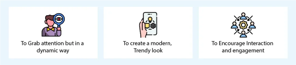
To Grab attention but in a dynamic way
Asymmetry takes a different approach by breaking predictable patterns. This strategy makes elements stand out and appear more interesting. This can help you direct the focus toward areas like CTA buttons or content.
To create a modern, Trendy look
Too many websites use symmetric interfaces and designs. Try adding some asymmetry if you want to stand out. By using bold and artistic asymmetry, you can appear more creative and innovative.
To Encourage Interaction and engagement
By taking a distinctive approach, asymmetry encourages users to interact with elements. This can potentially motivate them to click on the Call-to-action button. It can help make layouts feel more immersive and engaging.
Wrapping it up
Finding the right balance between symmetrical vs asymmetrical designs isn’t always easy. Design heavily impacts the user experience. In fact, 75% of users judge a company’s credibility by its website design and layout. Our aim should be to give them something that they remember. An engaging design naturally makes users want to stay.
At Linkitsoft, our skilled UI and UX designers create creative designs. They focus on providing an excellent user experience. Balancing symmetry with asymmetry can be challenging. Our experts can help you find the right balance! Contact us today and watch your designs stand out for being the most unique!


