
In 2016, Instagram changed its logo. The new look was bright, bold, and full of color. It was not just a small update. It was a big shift in design. The old, flat logo was gone. Instead, the new one had a smooth blend of colors. This caught the world’s attention.
This change was huge. It showed how powerful gradients can be. A simple color blend made Instagram feel fresh and modern. People noticed. Designers took notes. Many companies followed. Soon; gradients were everywhere—in apps, websites, and ads.
Once, gradients seemed outdated. But now, they are back. They add depth, style, and beauty. They make designs feel alive. Instead of flat, dull images, gradients bring a soft, blended effect. This makes everything look more modern and exciting.
That’s why this guide is here. It will help you understand gradients. You will learn about different types of gradients, the best ways to use them, and mistakes to avoid. We will also look at future trends. By the end, you will know how to use gradients like a pro. Let’s dive in!
Why Understanding Gradients Matters for Your Business & Design Needs?
Imagine you’re planning a birthday party. You have two invites—one is plain white with black text. The other fades from soft pink to gold with smooth color blends. Which one feels more exciting? The second, right? That’s the power of gradients.
Now, picture this for your business. A skincare brand with a soft peach-to-cream gradient feels calm and fresh—perfect for wellness. But a gaming app might use bold blue-to-purple blends to feel high-energy. Gradients do more than look pretty—they set the mood, guide the eye, and make your brand pop.
At the heart of it, a gradient is a soft blend of two or more colors. The colors mix little by little. So, instead of a sharp change, the shift is smooth. This makes the design feel rich and full. Flat colors just can’t do that.
And guess what? Gradients add depth. They give your work a fresh, sharp look. Plus, they help show what’s most key on the screen. So, if you’re working on a site, gradients make it pop.
Used well, different types of gradients help your customers feel what you want them to feel—relaxed, excited, or alert. Whether it’s a website, an app, or a product label, gradients shape how people see you. And in a world full of scrolls and swipes, standing out matters. That’s why understanding and using gradients is not just design—it’s smart business.
What are the Types of Gradients?
Gradients are not all the same. They come in different types, each with its own look and use. Knowing these types helps in making better designs. Below, we explore the most common types of gradients used in web and app design.
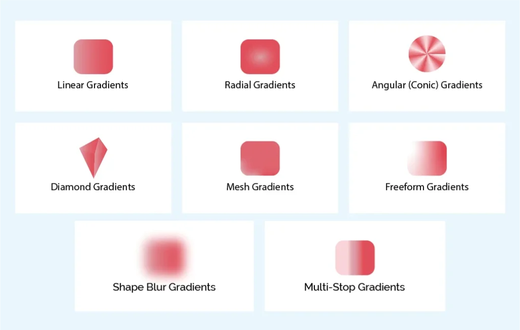
Linear Gradients
- What It Is: Linear gradients are the most popular. They create a smooth color shift along a straight line.
- How It Works: You pick a start color, an end color, and a direction. You can also add more colors for complex effects.
- Best Uses:
- Backgrounds: Adds depth without being too bold.
- Smooth Transitions: Helps sections blend well.
- Headers & Hero Sections: Makes websites more eye-catching.
- Buttons: Adds a soft 3D effect.
- Examples:
- Horizontal Gradient: Light blue to white.
- Vertical Gradient: Dark green to light green.
- Diagonal Gradient: Coral to peach.
Radial Gradients
- What It Is: Colors spread out from a center point in a circular way.
- How It Works: The color starts from a center and moves outward in circles or ovals.
- Best Uses:
- Focal Points: Draws attention to key areas.
- Spotlight Effects: Enhances call-to-action buttons.
- Depth: Creates a realistic light effect.
- Backgrounds: Adds texture and interest.
- Examples:
- Circle Gradient: Yellow to orange.
- Oval Gradient: Lavender to violet.
- Off-Center Gradient: Pink to gray.
Angular (Conic) Gradients
- What It Is: Colors spread around a center, like a color wheel.
- How It Works: Colors shift in a circular motion.
- Best Uses:
- Charts & Graphs: Great for pie charts.
- Decorative Effects: Adds style to graphics.
- Rotation Effect: Creates a sense of movement.
- Examples:
- Color Wheel: Smooth transition of colors.
- Segmented Colors: Used for pie charts.
- Soft Texture: Gray tones for sleek UI designs.
Diamond Gradients
- What It Is: Colors spread in a diamond shape.
- How It Works: The gradient extends out diagonally.
- Best Uses:
- Modern Backgrounds: Gives a stylish look.
- Bold Visuals: Makes shapes stand out.
- Depth & Structure: Adds layers to designs.
- Examples:
- Classic Diamond: Purple to lavender.
- Strong Contrast: Yellow to charcoal.
- Soft Diamond: Beige tones for an elegant feel.
Mesh Gradients
- What It Is: Uses a grid to blend colors smoothly.
- How It Works: Color points are placed on a grid and blend into each other.
- Best Uses:
- Complex Color Mixing: Allows detailed designs.
- Natural Textures: Mimics real-life surfaces.
- Scenic Views: Great for skies and landscapes.
- Tools to Create:
- Adobe Illustrator: Best for mesh gradients.
- Mesh-y for Figma: A plugin for designers.
- More Figma Plugins: For advanced gradient effects.
- Examples:
- Realistic Fruit Colors: Smooth peach tones.
- Abstract Landscapes: Rolling hills with color blends.
- Fabric-Like Texture: Soft shading effects.
Freeform Gradients
- What It Is: Colors can be placed anywhere.
- How It Works: Colors spread from different points in an organic way.
- Best Uses:
- Creative Designs: Unique and free-flowing.
- Soft Shapes: Works well with curves.
- Abstract Art: Adds complexity.
- Examples:
- Watercolor Style: Blended blues, pinks, and yellows.
- Abstract Face: Colors radiating from features.
- Fluid Shapes: Swirls of warm colors.
Shape Blur Gradients
- What It Is: Uses blurred shapes to blend colors.
- How It Works: Solid shapes are softened for smooth effects.
- Best Uses:
- Dreamy Effects: Adds a soft glow.
- Watercolor Look: Mimics painted transitions.
- Soft Backgrounds: Warms up designs.
- Examples:
- Pastel Gradient: Soft pink, lavender, and blue.
- Sunset Glow: Warm orange, pink, and purple.
- Foggy Texture: Blended blues and greens.
Multi-Stop Gradients
- What It Is: Uses many colors in one gradient.
- How It Works: Several colors blend smoothly in a single gradient.
- Best Uses:
- Detailed Patterns: Great for complex designs.
- Smooth Color Shifts: Seamless transitions.
- Realistic Depth: Adds a natural feel.
- Examples:
- Metallic Shine: Silver and gray blends.
- Rainbow Effect: Full color spectrum.
- Sunset Sky: A mix of soft, fading hues.
Gradients make digital designs more beautiful and eye-catching. They add depth, mood, and energy to websites and apps. Knowing how to use different types of gradients helps designers create stunning visuals. Try out different gradients and see how they transform your designs!
How to Use Gradients Effectively Best Practices & Tips?
Understanding gradients is just the start. To use them well, you need the right techniques. Here are the best ways to make gradients look great.
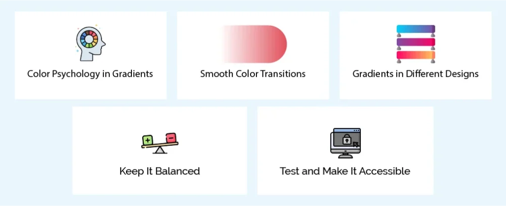
Color Psychology in Gradients
Colors create feelings. This is important in web and app design. The right colors can make users feel calm, excited, or professional.
- Calm and Relaxing: Use soft blues, greens, and purples. They create a peaceful mood.
- Example: Light blue to sea green feels soothing.
- Energetic and Bold: Use warm colors like red, orange, and yellow. These add excitement.
- Example: Bright yellow to deep orange looks lively.
- Professional and Trustworthy: Blue, gray, and soft green feel serious and reliable.
- Example: Light gray to steel blue adds stability.
- Creative and Fun: Bright, unexpected colors add playfulness.
- Example: Hot pink to electric blue feels imaginative.
Examples of Color Combinations
- Calm: Light Blue (#E0F7FA) to Sea Green (#00BCD4)
- Energetic: Bright Yellow (#FFEB3B) to Fiery Orange (#FF9800)
- Professional: Light Gray (#ECEFF1) to Steel Blue (#607D8B)
- Creative: Hot Pink (#F06292) to Electric Blue (#448AFF)
- Luxurious: Gold (#FFD700) to Deep Burgundy (#880E4F)
- Natural: Sky Blue (#87CEEB) to Sunset Orange (#FFA07A)
Smooth Color Transitions
Harsh lines can make a gradient look bad. Smooth transitions are key. Here’s how:
- Use More Color Stops: More stops create better blending.
- Choose Colors That Blend Well: Pick colors close on the color wheel.
- Add Middle Colors: If colors are very different, use a mix in between.
- Example: Blue to yellow looks better with green in the middle.
- Adjust Midpoints: This changes how fast colors blend.
- Use Opacity: Fading colors slightly can create smoother shifts.
Gradients in Different Designs
Branding
- Logos: Many modern logos use gradients for a sleek look.
- Brand Colors: A gradient version of a brand’s color makes it more flexible.
Web Design
- Backgrounds: Gradients make websites look stylish.
- Buttons: They add depth and make buttons stand out.
- UI Elements: Progress bars and sliders look better with gradients.
- Hero Sections: The main image of a webpage often uses a gradient to grab attention.
App UI
- Backgrounds: Just like in web design, gradients add depth.
- Icons: Many apps use gradients for a modern feel.
- Interactive Elements: Changing gradients when a user clicks adds a nice effect.
Illustrations
- Shading and Depth: Gradients make illustrations look more realistic.
- Creative Effects: They add style and uniqueness.
Marketing Materials
- Flyers and Banners: Bright gradients catch attention.
- Social Media Graphics: Gradients help posts stand out.
Keep It Balanced
- Don’t Overuse It: Too many gradients can look messy.
- Match with Other Elements: Gradients should not clash with text or images.
- Place Them Well: Use gradients to highlight important parts of a design.
Test and Make It Accessible
- Test on Different Screens: Gradients may look different on phones and computers.
- Check Contrast: Make sure the text is easy to read over gradients.
- Use Contrast Tools: Websites can check if colors are readable.
- Consider Vision Problems: Some users may struggle with complex gradients.
By using these tips, you can create smooth, stylish, and effective gradients in web and app design. When used well, gradients make designs more engaging and appealing.
What are the Common Mistakes to Avoid When Using Gradients?
Even when you know best practices, mistakes can still happen. Gradients can be tricky. Knowing common errors will help you improve your designs.
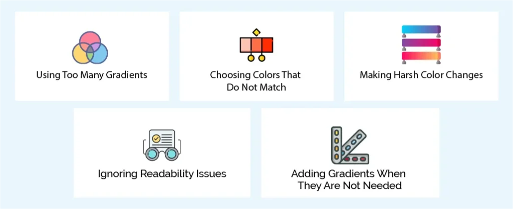
Using Too Many Gradients
The Mistake: Adding gradients everywhere. Backgrounds, text, icons—too much can make a design look messy.
Why Avoid It: Too many gradients create clutter. The design looks confusing and unprofessional. It becomes hard to focus on key elements.
The Solution: Use gradients wisely. Add them to highlight important areas. Keep some parts simple. Balance is key.
Choosing Colors That Do Not Match
The Mistake: Picking colors that clash. Some colors do not blend well together.
Why Avoid It: Bad color choices hurt the design. It can feel harsh or unappealing. Colors should create a smooth, pleasant effect.
The Solution: Follow color rules. Use colors that work well together, like similar shades or complementary colors. Test different options. Many design tools help with this.
Making Harsh Color Changes
The Mistake: Colors change too suddenly. The gradient does not blend smoothly.
Why Avoid It: Sharp transitions look bad. They make the design feel rough and unprofessional.
The Solution: Use more color stops. Pick colors that mix well. Adjust blending points for a smoother effect.
Ignoring Readability Issues
The Mistake: Using gradients behind text without checking contrast.
Why Avoid It: Poor contrast makes text hard to read. Some people may not see it well. Accessibility matters.
The Solution: Check the contrast with online tools. Make sure the text stands out. If needed, change the gradient or text color.
Adding Gradients When They Are Not Needed
The Mistake: Using a gradient where a simple color would be better.
Why Avoid It: Too much detail can distract from the message. Simple designs often work best.
The Solution: Think before adding a gradient. If a solid color looks cleaner, use it. Gradients should improve the design, not complicate it.
By avoiding these mistakes, your designs will look cleaner, more professional, and easier to understand.
Conclusion
Gradients were once a thing of the past. But now, they are back and stronger than ever. Designers love them, and they are everywhere. From websites to apps, different types of gradients make designs stand out.
We looked at many types of gradients. There are linear, radial, angular, diamond, mesh, freeform, shape blur, and multi-stop. Each has its own magic. They add style, depth, and movement to your designs. If you want your work to shine, gradients are a must.
Today, the digital world moves fast. If you ignore gradients, your designs may look outdated. Flat colors are dull. But gradients add life. They grab attention and create emotion. They make web pages and apps feel modern and fresh.
That’s where Linkitsoft can help. We are experts in creating eye-catching gradients. Whether you need linear, radial, mesh, or freeform, we have you covered. Our team blends colors beautifully. We make sure your visuals pop. Your audience will love the result.
Don’t settle for boring designs. Use gradients to stand out.
Let Linkitsoft take your visuals to the next level. Our clients love what we do, and you will, too. Want to make your designs amazing? Contact Linkitsoft today. Let’s bring your ideas to life with stunning gradients. The future of design starts now!


