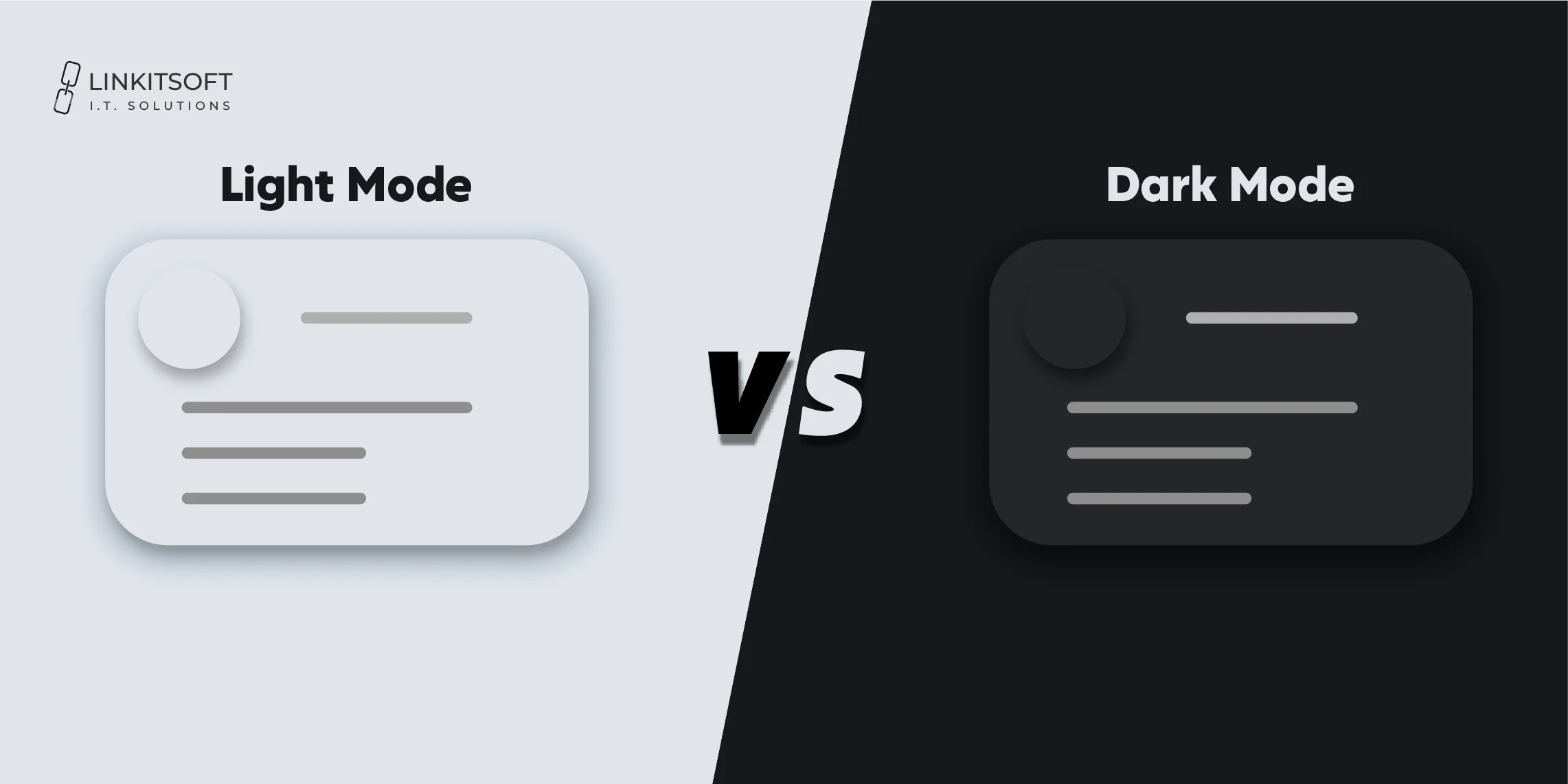
Let’s be real. At some point, we’ve all had that moment. You open an app late at night, and BAM! Light mode blinds you like you just looked directly into the sun. Or maybe you’re trying to read something during the day. Then, dark mode starts suddenly feeling like you’re deciphering hieroglyphs in a cave. Sounds familiar?
You could just be someone with strong feelings about screen brightness. So, the light mode vs dark mode debate is far from over. In fact, it’s more relevant than ever in modern app development. This also isn’t just about a visual preference. It is a part of the user experience (UX).
Mobile app design is a serious topic. It can not be overlooked so easily. Hence, light mode vs dark mode is a sensitive thing here. So, let’s dive in and understand what you should choose for your mobile app.
What is light mode?
Light mode is the classic display setting we all grew up with. It is the OG of user interfaces for software developers. It features dark text on a bright (usually white) background. Think of your typical document editor, default web page, or most apps back in the early smartphone days.
It mimics how we read ink on paper, which feels natural to the human eye, especially in well-lit environments. The same follows for mobile app design. It has been a standard for so long because it helps users feel comfortable. It is because it creates familiarity.
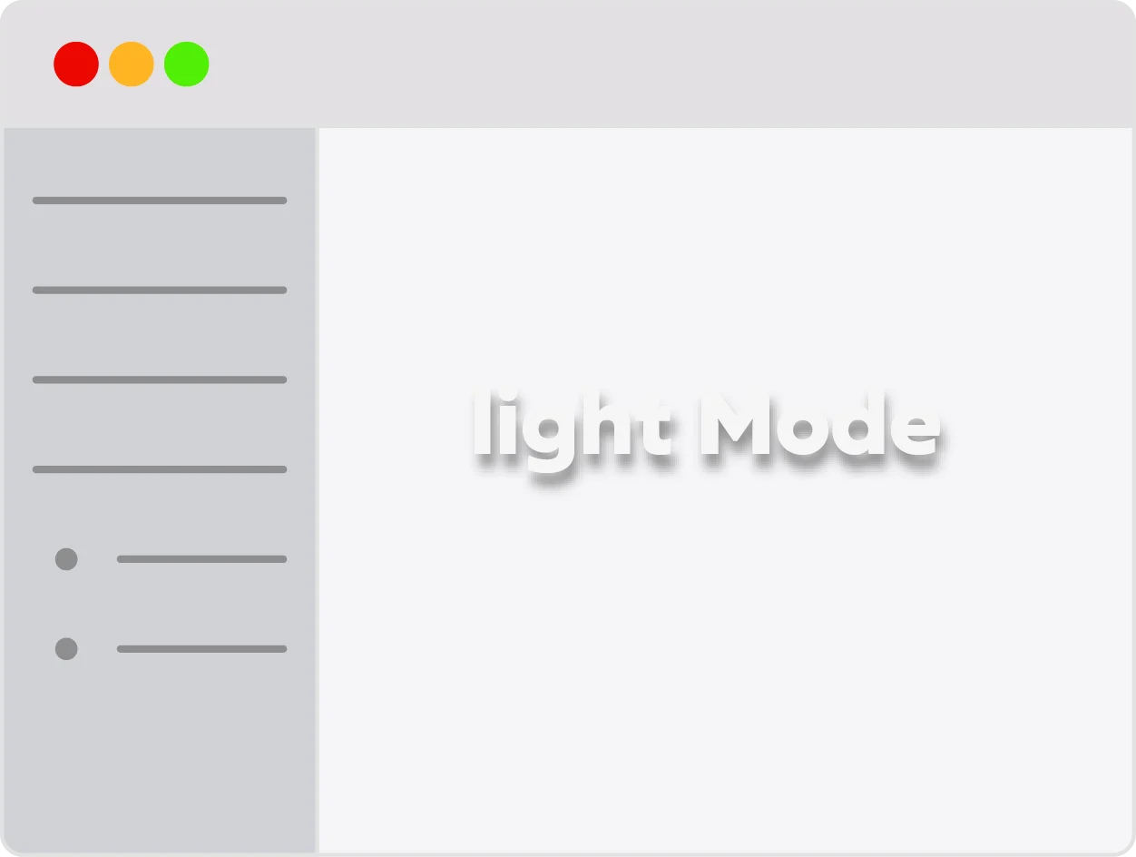
Thanks to the contrast in light mode, text stands out. This often helps with accessibility. The more accessible the design of a product is, the more available it becomes. This is very beneficial for businesses.
What are the advantages of using light mode?
Light mode vs dark mode comes down to personal preference. This happens often. Yet its impact on design matters as well. From a designer’s perspective there might be some unique advantages you’ll find. However, we gathered some that’ll dissect both user and designer perspective:
- Light mode performs better in bright or outdoor environments. This is because it makes screens easier to read in daylight. There isn’t any strain.
- It closely resembles traditional printed text. Most people are used to that. It feels more natural and familiar for users who often read on paper.
- The high contrast between dark text and a white background looks better. It supports better legibility. This is helpful apps or websites that are text-heavy.
- Most websites and software default to light mode. Many users often find it easier to navigate without needing to adjust settings.
- Some users have visual conditions like astigmatism. In this case, light mode can reduce issues like blurring or discomfort.
Light mode is preferred by 45.5% of users. For some, it is the accessibility. Yet, many go for the aesthetic and minimalism associated with lighter themes.
What is dark mode?
Dark mode is the straight opposite of light mode. It flips the traditional color scheme. How? It places the light-colored text and elements on a dark (usually black) background. Think of it like night vision for your apps. A dark mode app isn’t too bright.
Dark mode was popular with UI designers and development people. In recent years, it has found popularity among users too. You can now find it across several operating systems and software. It gives a unique user experience ux. This is because it stands out from the traditional modes.
It’s not just a style statement. A dark mode app is often easier on the eyes in low-light environments. It even helps conserve battery on OLED screens. Users love apps that don’t consume too much battery. Dark mode apps have an aesthetic that can make a device look cool. It can give apps a futuristic vibe.
But as trendy as it is, dark mode isn’t always the best fit for every app or user. Yet, up to 82% of smartphone users prefer using dark mode. Some people just love how soothing it feels on the eyes. No one would deny the way it saves the battery.
What are the advantages of dark mode?
Dark mode comes with many unique advantages. Let’s start with how it has a completely different vibe. It is different from traditional designs. Sometimes, users just love the way they look. Of course it’s a distinct aesthetic. Let’s look at its advantages in mobile applications:
- It helps extend battery life on OLED and AMOLED screens. This is because darker pixels consume much less power than light ones.
- The dark mode creates a focused and distraction-free experience. It does so by putting less visual emphasis on the background. It puts it more on the content itself.
- In mobile applications, it reduces screen glare and light sensitivity. It is especially beneficial for users with migraines or visual fatigue.
- Many users find dark mode aesthetically pleasing and modern. After all, it offers a sleek and high-tech look to apps and interfaces.
- The lower brightness of dark backgrounds can minimize blue light exposure. This contributes to better sleep when using devices before bed.
However, despite these advantages, developing software application with only dark mode may not be a clever move. Think about providing your users with the flexibility of choosing between the light mode vs dark mode.
Light mode vs dark mode: A deep comparison
In mobile app development, the light mode vs dark mode debate can be diverse. It goes way beyond personal taste. It’s about a unique user experience with every mode. The design of software connects with users on an emotional level. Let’s compare both to understand better:
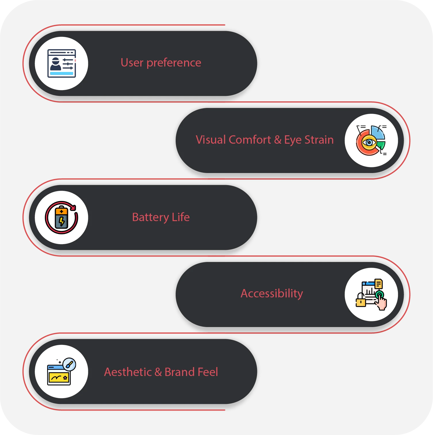
User preference
Light Mode is generally favored by users during the daytime. It is also preferred in well-lit environments. This is probably why it is the default in most systems and apps. Many users stick with it simply because it feels familiar.
Dark Mode, however, has grown in popularity in the recent years. You can especially see this among younger audiences and tech-savvy users. It is also popular for those using apps at night. In fact, some users even switch between modes. For them, it depends on the time of day or task.
Visual Comfort & Eye Strain
When developing software applications, light mode offers high readability in daylight. It works great in bright conditions. This makes it ideal for reading large blocks of text effortlessly. However, it can be too strong. This can cause eye fatigue in dim environments.
Dark Mode significantly reduces glare. That’s probably why it is loved so much. It is just gentler on the eyes in low-light settings. It’s especially helpful for users who experience screen-related headaches. It is even more helpful for those who experience light sensitivity.
Battery Life
The light mode display generally uses more power. You’ll see this particularly on OLED and AMOLED screens. This is because displaying white or bright backgrounds requires more pixels. This consumes battery quicker.
Dark Mode can help conserve battery on compatible displays. This is because dark pixels draw less power. This makes a noticeable difference for heavy mobile users. Sadly, many users spend their time on mobile phone for over 7 hours.
Accessibility
Light Mode may can be more accessible for users with certain visual impairments. Think of people with astigmatism. Here dark text on a light background can be easier to read. Vice versa, it could be harder to read text on a dark background.
Dark Mode benefits users with photophobia or sensitivity to light. This way, it is accessible in both ways. However, it can sometimes reduce readability. This rarely happens when the color contrast isn’t well-designed. However, UI designers and development takes care of this.
Aesthetic & Brand Feel
Light Mode communicates clarity, cleanliness, and a traditional design approach. It’s often used by professional, academic, or healthcare-related apps. This is because it feels familiar in these places. It helps make the user interface look more appealing and navigable.
Dark Mode creates a modern and immersive feel. It stands out. This is why it isn’t owned in traditional places like documentation. It is actually embraced in entertainment and gaming. Use dark mode when you want creative apps where style and mood matter.
What are the Best Practices for Implementing Light mode vs Dark Mode?
Both light mode vs dark mode should be implemented carefully. This is because each creates a unique user experience. Let’s see the best practices you can implement for perfect looks:
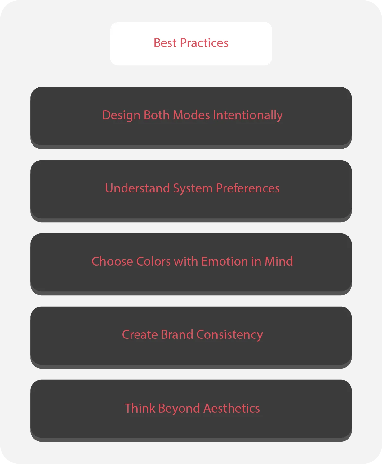
Design Both Modes Intentionally
Create better consistency across all pages. Build them like you mean it. It isn’t just about design and aesthetic. It is also about functionality and the user experience ux.
Understand System Preferences
In light mode vs dark mode, you should know, sometimes there is just the system theme. So, make sure your app responds to system-wide preferences. Users shouldn’t need to adjust it every time they open it.
Choose Colors with Emotion in Mind
Light mode tends to evoke a sense of clarity. Dark mode can feel more technical and immersive. Pick according to what your app is meant for.
Create Brand Consistency
You probably know how important consistency is in design. In light mode vs dark mode, you should ensure that both modes should reflect the brand’s personality.
Think Beyond Aesthetics
Aesthetics do matter. But the usability and functionality do a lot too. So, test your designs thoroughly in different lighting conditions. Make sure they are usable.
How can Linkitsoft help with light mode vs dark mode app development?
The light mode vs dark mode debate isn’t one that will end easily. It’s an important part of the user experience design. It isn’t that much of a big part. Yet, it can have heavy impacts on our users. Around 94% of first impressions about a software are influenced by design. That’s a lot of people.
Whichever mode you’ll choose will affect this impression. Of course, your app’s purpose also plays a big role here. Ultimately, you can just give users a way to adjust according to their personal preference. In the end, it’s the best solution.
Yet, it isn’t just about changing colors. It is about delivering two different experiences in the modes. Light mode vs dark mode can allow you to express your app in different ways. This is where Linkitsoft can help you create a unique experience in every mode.
At our company, we understand the way design impacts a person. Did you know that around 88% of people don’t even return after a bad experience on a certain software? We don’t want this to be your business. The user experience ux matters, and so does light mode vs dark mode.
Let’s wrap it up
Hopefully by now, you’ve decided whether you want light mode vs dark mode. Even if you want both, it’s fine. With the right designers, you can achieve that. Our designers follow the best UX design principles. No matter if it’s a dark mode app or a light one, we guarantee:
- Clear and navigable user interfaces. Our designers make sure the user experience is engaging and interactive.
- Each mode will provide its own experience. Whether you’ve chosen one or want both, we’ll deliver it.
- The designs will adjust according to screen size. We also prioritize mobile-first design in Mobile App Development.
So, which did you choose? Did you pick one or select both? Our designers and Software developers are eager to help you create the relevant experience! Connect with Linkitsoft today. Let’s create your light mode vs dark mode app. Get started today, don’t wait around for your rivals to do better.

