Every $1 invested in UX design yields a $100 return, as per Forrester’s UX Investment Return. It highlights the financial impact of good UX. That’s an ROI of up to 9,900%!
Bad UX design is more costly than you think. Especially post-launch. In fact, 88% of visitors never visit a website if their visit is poor, and businesses lose billions of dollars every year due to poor usability. Poor information architecture or an insufficient UX process often causes frustration. It naturally makes visitors abandon your product.
That’s right—your product may be pushing users away. It wouldn’t be because of its features, but because of how difficult it is to use. The most beautifully designed digital products do more than simply look good. These products enrich the user experience and make users feel in command, confident, and at ease. Whether designing for UX or UI, every detail makes a difference.
But there’s good news: UX design principles can transform any digital experience. This blog post is your practical handbook for 12 essential UX design principles. Master these, refine your UX process, and optimize your information architecture. Through their help, you’ll be well-equipped to create products that users not only use but also love.
What exactly is UX design?
Imagine you want to book a flight online. You land on a website that looks messy, hard to use and lacks clear steps. You struggle to find what you need. The slow, confusing site frustrates you, so you leave and book with a competitor instead. This doesn’t affect you as much as it affects these companies. One lost revenue, while the other heavily generates it.
Now, think about a smooth platform like Airbnb. You search, book, and pay without stress. That’s the power of user experience. You may even recommend Airbnb to someone without using it because of the UX others have experienced.
UI/UX Design Services is simply the process of keeping digital products accessible, efficient, and enjoyable. Great practices in UX design provide smooth navigation and easy interaction.

Why do you need to follow UX design principles?
Think of UX design principles as a guiding light. They help create experiences that users love. In today’s busy digital world, following the right UX process can take you a long way. By structuring strong information architecture, you can make your business stand out. A good UX will help build trust and increase user conversions. This will lead to greater success and higher revenue.
UX design principles effortlessly allow you to fulfill your goals. It doesn’t matter if you have an app, an online store, or an online service. The point is that good UX design principles encourage visitors to keep on visiting and coming back.
The 12 Principles Of UX Design Principles
UX design means making products easy and fun to use. Of course, this is about delivering a good user experience. When you design software that helps users find what they need quickly, they love it. Think about your own experiences with apps that were simple and quick to use. Just like that, your product should also ensure that it works well for everyone.
The Interaction Design Foundation says, “UX design is designing products to deliver valuable experiences to users.” These UX Design principles consist of:
- Design
- Branding
- Usability
- Functionality
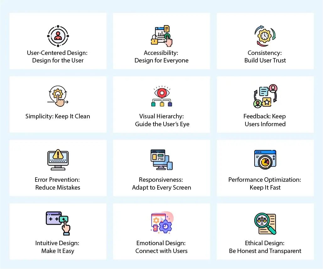
Think of UX design in terms of a map. This map directs designers to create great, accessible products. In today’s digital tools age, such guiding principles yield clear and compelling designs. This is what actually matters when you deliver software. If you want it to succeed, then follow these 12 design principles:

1. User-Centered Design: Design for the User
User-centered design directly focuses on what the users need. It employs studies such as surveys and testing to develop the optimal experience. This involves understanding your target user’s emotions.
Why It’s Important:
- 70% of online businesses fail because of bad usability. This causes them a lot of loss.
- User-centric designs increase engagement. They also boost a business’s success. Users genuinely resonate with products that make them feel understood.
Example:
Before: On an online store platform, the checkout process has too many steps. This frustrates users; more than half of them leave when they reach the checkout page.
After: You can update this to a simple checkout with fewer steps. You can further improve this by adding a guest checkout. Many users want to make a purchase without creating an account.
Checklist:
- Conduct surveys and tests. This will help you ensure that your users love your design.
- Create user personas. It will help you understand your audience better. This way, you’ll be able to create resonating designs.
- Keep testing and improving. Don’t stop till you get the perfect product.
2. Accessibility: Design for Everyone
Accessibility means making products work for all users. This includes those with disabilities. A product that’s accessible to all wins the hearts of many.
Why It’s Important:
- More users can enjoy the product. Everybody wants lots of users to enjoy their product.
- Avoids legal problems. Yes, it’s possible to get into legal problems if your website isn’t accessible enough.
Example:
Before: Low-contrast text on a busy background. It’s hard for some people to read because of this. Especially people who wear glasses.
After: High-contrast text with clean spacing. It will make it easier for people with weaker eyesight to read. Additionally, you can add customization options to your website’s options. This will help users adjust themselves.
Checklist:
- Use high-contrast colors for your text. In comparison, use a low-contrast background to help the text pop out. This will also make it easy to read.
- Support keyboard navigation. Make it possible to navigate through keys instead of the mouse.
- Test with assistive tools. Several tools will allow you to test the accessibility of a product.
3. Consistency: Build User Trust
Consistency means keeping design elements the same across a product. Think of how confusing it will be if colors and fonts keep changing as you scroll down a website. In most cases, users will leave such a site, thinking what just happened?
Why It’s Important:
- Reduces confusion. You want users to leave your site happy if you want them to return. Loyalty comes from satisfaction, not confusion.
- Makes the product easier to use. Of course, no one wants to use a product that is hard to understand.
- Builds trust: Consistency in your brand will subconsciously build trust for your users. This will increase client loyalty and keep them coming back.
Example:
Before: Buttons and menus look different on each page. This confuses users. It also makes them feel frustration. Due to this, you lose a lot of users.
After: A consistent design system. This will help users resonate with your product. It will ultimately increase user conversions.
Checklist:
- Follow a design system. Pick 2-3 colors and use them across your website. Do not go for more than two fonts.
- Use the same UI elements across the product. Don’t add varying UI components. It will confuse the users.
4. Simplicity: Keep It Clean
Simplicity removes clutter and focuses on key elements. This again connects to confusion. Focusing on simplicity will help you create easy and clean designs.
Why It’s Important:
- Makes products easier to understand. When users quickly understand a product, they feel happy to use it.
- Saves users’ time. These days, everyone is in a hurry. Users love platforms that get their work done quickly and effectively.
Example:
Before: A homepage with too many links. This can be overwhelming for users, and they may leave such a site.
After: A clean homepage with one main call to action. This will actually compel users to contact you.
Checklist:
- Show only important content. Do not add unnecessary clutter.
- Use whitespace to improve clarity. White color automatically soothes the eyes, users love it.
5. Visual Hierarchy: Guide the User’s Eye
Visual hierarchy helps users see the most important information first. Structure your information in such a way that users understand it easily.
Why It’s Important:
- Helps users find what they need quickly. It saves them time and increases loyalty rates.
- Reduces confusion and helps users understand your product easily.
Example:
Before: All text looks the same. There is no structure. No headings either. Users don’t understand anything and just leave.
After: You start adding bold headlines, bullet points, and different colors to highlight key information. More than 80% of users only skim a webpag, this structuring will make it easy.
Checklist:
- Use headings and bullet points. This will make it easier to understand and convey information.
- Space out content properly. Don’t jumble it up.
6. Feedback: Keep Users Informed
Feedback gives users confirmation after they take action. Let them update you about what they want in your business.
Why It’s Important:
- Builds trust. Naturally, this will make users feel like your source is credible.
- Reduces uncertainty. It helps reassure them about your business.
Example:
Before: Clicking a button with no response. It doesn’t change in size or do anything.
After: A button that changes color and shows a message resonates with your user.
Checklist:
- Add visual indicators for actions so that users know that your software acknowledges them.
- Show clear error messages. If there is an error, tell your users. Don’t leave them hanging.
7. Error Prevention: Reduce Mistakes
Preventing errors makes users feel more confident. It helps them feel like they know what they’re doing.
Why It’s Important:
- Reduces frustration. Of course, no one wants to use a frustrating product.
- Saves time. Who doesn’t love software that saves them time?
Example:
Before: A form lets users submit incorrect info. It later gets them in trouble.
After: Adding validation that prevents errors. It will help users feel more confident in submitting their info.
Checklist:
- Use auto-complete and constraints. This will help users.
- Add confirmation dialogs to update your users.
8. Responsiveness: Adapt to Every Screen
Responsive design ensures the product works on any device. More than 60% of searches come from mobile devices. It’s vital to deliver mobile-responsive designs.
Why It’s Important:
- Improves the user experience. Users find it easy to navigate your site on any device.
- Boosts search rankings. Google prioritizes mobile-first websites.
Example:
Before: A website that needs zooming on mobile. The users would leave.
After: A mobile-friendly design. Most users will love this.
Checklist:
- Design for mobile first. Then make it responsive for desktop.
- Test on different devices.
9. Performance Optimization: Keep It Fast
A slow website can drive users away. In fact, 40% of people leave if a site takes more than 3 seconds to load. That’s why speed is key. It makes users happy and improves their experience. If a site is slow, users get frustrated and may never return. So, always test for speed to keep things running smoothly.
Why It’s Important:
- Users stay longer. A fast site keeps people engaged.
- Fewer people leave. A quick site reduces bounce rates.
Example:
Before: A website loads slowly. Images take forever to appear. Users get annoyed and leave.
After: Images are compressed. Code is optimized. The site runs smoothly and loads fast.
Checklist:
- Reduce image size. Smaller images load faster.
- Use speed tools. These help you check and improve site speed.
10. Intuitive Design: Make It Easy
A good design feels natural. Users should find what they need without thinking too much. A simple, clear layout helps people move through a site with ease. The best designs follow patterns people already know.
Why It’s Important:
- Less confusion. Users learn quickly and feel comfortable.
- More engagement. People enjoy easy-to-use sites.
Example:
Before: Buttons and menus are hard to find. Icons don’t make sense. Users get lost.
After: Clear labels, simple menus, and a clean layout. Users know exactly what to do.
Checklist:
- Follow common designs. Don’t confuse users with new layouts.
- Use clear words and icons. Make sure people understand what each button does.
11. Emotional Design: Connect with Users
People connect with designs that make them feel something. Colors, words, and animations can create an emotional response. A good design makes users feel happy, safe, or excited.
Why It’s Important:
- Leaves a strong impression. Users remember their experience.
- Builds trust. A good design makes people feel comfortable.
Example:
Before: A dull website with no personality. It feels lifeless.
After: Fun colors, friendly words, and smooth animations. Users enjoy their time on the site.
Checklist:
- Show your brand’s personality. Make users feel welcome.
- Use colors and images wisely. They should match the mood of your brand.
12. Ethical Design: Be Honest and Transparent
Good design is honest. It should help users, not trick them. People trust sites that are clear and fair. Hidden fees and misleading buttons make users angry. A clear, honest design builds trust.
Why It’s Important:
- Builds credibility. Users trust honest brands.
- Keeps users safe. Transparency protects people from scams.
Example:
Before: A site tricks users into clicking ads. Prices are hidden until checkout.
After: Honest pricing and clear navigation. Users know what to expect.
Checklist:
- Be upfront about costs. No hidden fees.
- Keep things simple. Users should always know what they’re clicking on.
A great design is fast, simple, and honest. When you focus on these things, users will love your product. Keep testing and improving to make their experience even better.
Conclusion
In today’s digital world, omitting to include UX design practices might cost you business, bounce rate, and business loss. Did you know that 70% of online businesses fail solely on account of poor usability? If you do not prioritize user experience, you might fall behind.
We at Linkitsoft specialize in user-first design, accessibility, intuitive UI, performance, and moral UX practices so your product stands out. We have our team of professionals designing engaging, top-performance, and accessible digital solutions to optimize conversions and client satisfaction. Don’t lose business to bad design—partner with Linkitsoft to craft seamless, intuitive, and visually appealing digital experiences. The competition is already investing in better UX—can you do any less? Contact us today to take your digital life to the next level and ahead of the competition!


