
Ever struggled with reading a webpage that felt like a jumbled mess? You’re not alone; we’ve been there, too. When a website does not have a proper typography hierarchy, even the most valuable content can become an unreadable nightmare.
It takes 0.05 seconds for a user to form an opinion about your website. Let’s assume you pass that stage, and the user decides to stay. The user now searches for the information they need on your website. Only to find a cluttered mess. Disappointed, the user leaves, never to return.
46% of consumers judge a website based on its typography alone. That’s why it’s essential to follow a powerful typography hierarchy strategy. Yet, you’ve been getting your content wrong and finding mistakes in your typography.
But what if I told you that there was a way you could fix that? In our guide, we’ll explore how to adjust the typography hierarchy of your website. We’ll reduce clutter and deliver clarity. Let’s dive in.
Understanding Typography Hierarchy
Typography consists of the text on a webpage. In typography hierarchy, we explore ways to make the text more readable. It’s a way to convey information in a straightforward way.
Through typography hierarchy, you can highlight and structure important information. Without typography, the text would look dull. In fact, it would just look like lots of text on a background without making any sense.
What is the Importance of Hierarchy in Design?
Hierarchy is one of the elements of designing. It works on structuring and arranging information on the basis of its importance. It works on guiding the viewer’s eyes naturally through the design.
Hierarchy creates a focal point by emphasizing a certain element. This draws immediate attention and makes it stand out. Typography hierarchy is about accentuating text in a way that doesn’t feel overwhelming and gets highlighted properly.
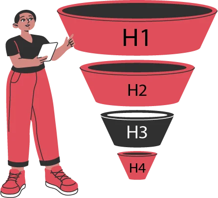
What are the Levels of Typography Hierarchy?
Typography hierarchy is all about breaking information down into pieces. Then, you arrange the information in a way that conveys your message effectively. In a website design, good typography can increase user conversions by up to 24%. Let’s see the three levels in typography hierarchy:
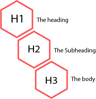
The heading
What was the first thing you noticed in the text when you opened our page? The heading! This is the first level of typography hierarchy. It works as the focal point of our page, guiding the viewer’s attention naturally.
- The main heading has the largest font size. It’s also often the boldest.
- Thanks to this style, it captures the reader’s attention instantly.
- Headlines often use distinct fonts or colors. This helps them stand out and convey the main message effectively.
The heading is often short, summarizing what the user can expect on the rest of the page. In website design, headings play a vital role. This is especially true on blog pages.
The Subheading
The second level is the subheading. What you’re reading right now is the subheading of our main headings. They provide additional context and brief summaries of what’s coming under the main heading. Subheadings also help categorize information.
- The subheadings help maintain the reader’s interest.
- They are slightly smaller than the main headings but prominent enough to create breaks between sections.
- Helps the reader smoothly transition from the main heading down to the information.
Comparing it to the rest of the text, a subheading is also generally short. Not to overwhelm the reader. Users can quickly skim through, stopping at the subheading they want more info on.
The body
Here comes the main information: the body text. This is the primary content that the user is actually here for. It’s generally the smallest and most readable. Written with adequate spacing and alignment.
- This is the smallest and most readable text.
- It’s often arranged in point to make it easier for users to skim through.
- Content is structured in short paragraphs and sentences.
A good body of typography ensures smooth reading. It helps convey information easily. 80% of users only skim through web pages, structuring the information properly can help them find the right information quickly.
Since the typography hierarchy is one of the elements of designing, structuring information according to these levels works as a principle.
What Are the Key Elements of Typography Hierarchy?
The key elements of typography hierarchy help organize the content. It gives typography design ideas that help each section and out. This way graphic designers are able to arrange the content to convey the message effectively. This reduces clutter and looks appealing. Let’s see what these key elements are:
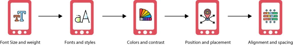
Font Size and weight
When you visit a webpage and see big, bold words, you instantly know what the webpage is about. This is because of the font’s size and weight. The size tells you whether the text is a heading, a subheading, or a body text.
Using boldness adds weight to the text. This helps convey emphasis. It’s always best to choose varying font sizes for the different levels of text.
Fonts and styles
Ever visited a website where the font was so thin and tight that you couldn’t read at all? You probably left that website. Who would read something like that? This is why it’s vital to select readable fonts that don’t overwhelm a user.
To create more emphasis, you can use two different fonts at different levels. In the elements of designing, you can also use italic and underline styles.
Colors and contrast
Color impacts visual hierarchy in many ways. Imagine if our blog’s page was pink and it had pink text over it. Both colors would be same with little contrast. You wouldn’t be able to read it. Similarly, a blue background and yellow text wouldn’t seem okay either.
When creating a professional website’s typography hierarchy, it’s necessary to select mature, contrasting colors. For example, white background and black text.
Position and placement
How you place the context helps the reader understand what’s up. Think of a webpage that shows you the main text first, and the hands come below. This wouldn’t even make sense if it were a “distinct approach.”
You should place the most important content at the beginning of your page. After you break the content down into three different levels, arranging them will be easy.
Alignment and spacing
Follow consistency with alignment. This is about centering the text body at the right place. Varying alignments create a sense of distrust. In the website design, you need to ensure that the typography is aligned perfectly.
Spacing also compliments the alignment and positioning. The use of white space eases users and soothes the eyes. Ensure you add the same spacing throughout the whole document.
These five elements of designing matter most when creating a website design. You can experiment with UX wireframes to see which fonts work best for you. The typography hierarchy impacts the user experience more than you think.
How to create a typography hierarchy in design?
Creating a strong typography hierarchy is all about structuring content and making it easy to read. Engaging text automatically retains users. This is why designers experiment with the elements of designing stated above.
This way, they’re able to guide the reader’s eye and emphasize the right information. Here’s how to build an effective typography hierarchy in your website design:
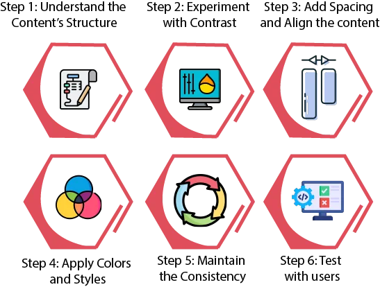
Step 1: Understand the Content’s Structure
Understanding the content’s structure involves identifying the text elements. Through this, graphic designers are able to sort out the primary and secondary texts. It allows them to determine which information should stand out.
- Naturally, headings should be the most prominent.
- Subheadings are meant to provide additional context for headings.
- The body text needs to be clear and easily readable.
Once you understand the text’s structure, arranging it becomes easy. A good content structure and easy readability resonate with users. Good typography improves the reading speed by 35%, helping users find the right information quickly.
Step 2: Experiment with Contrast
You can also experiment with different font styles, sizes, and contrasts in UX wireframes. This will help create differences between sections. Proper line spacing between text increases comprehension by 20%. This is because it reduces eye strain.
- Use larger, bolder fonts for main headings. This immediately catches the user’s eye.
- Use medium-sized fonts for subheadings. This helps users skim through your content.
- Use lighter, smaller fonts for body text. Does not make it overwhelming for the reader.
Contrasting sizes, colors, and font styles make it easier for readers to understand and analyze what’s up. Make sure you create a balance between the contrast and also the background. Your aim is to retain users, not overwhelm them.
Step 3: Add Spacing and Align the content
Spacing and alignment play a significant role in maintaining readability. Aligning text correctly heavily impacts the way content is perceived. Varying alignments that don’t follow a pattern create a sense of distrust.
- Proper line spacing prevents text from feeling cluttered. Too much is not good either.
- Appropriate margins and paragraph spacing create a natural flow. This alignment creates a sense of credibility about the brand.
- Mostly, the text is aligned at the left or in the center. This is according to the way a reader’s eyes naturally flow.
Proper spacing and good alignment also impact the readability. This makes the content look cleaner and more concise. The more natural your reading flow is, the more likely readers will stay to read.
Step 4: Apply Colors and Styles
You’ve probably seen some sites that use color codes. The most common example could be blue for links. This color coding is a unique way of standing out from competitors. It also helps convey important information easily.
- Colors and different styles can be used to highlight important points.
- Using bold and italic styles along with colored fonts can improve readability.
- This approach helps break up large blocks of text and direct focus to the main messages.
Users love it when they find a webpage showcasing information with clarity. It puts the reader in a position where they feel confident about themselves. Try experimenting by adding pastel colors to your typography hierarchy.
Step 5: Maintain the Consistency
Just imagine, there’s no alignment or pattern. Text is everywhere without any structuring. The lower you scroll, the more the font styles and sizes are changing. There is no consistency. You’re probably disappointed and even shocked.
- Maintaining consistency subconsciously builds a sense of confidence and credibility about a brand.
- Consistency conveys professionalism and order.
- Being consistent with your typography also creates a sense of predictability. This way, users enjoy reading.
Consistency also affects the user experience. This is because it guarantees that the experience is the same on each platform. When a brand follows consistency, it shows that it’s a detail-oriented and thoughtful business. You can experiment with different typography design ideas for this.
Step 6: Test with users
Since typography affects the user experience, it’s an excellent idea to test your typography choices. You can gather some valuable insights through testing. This will help you restructure and improve your content.
- Gather a team of readers who could help test your text. Once they’re done reading, ask them to leave feedback.
- This testing will help you identify areas for improvement.
- Testing with users can help you avoid rework and issues after the launch.
Whether it’s a website design or a product page, users should be your priority. Testing with them can give you unique feedback. Make sure you test with the right users. This will help you maximize the content’s clarity and create better engagement.
What are the mistakes to avoid when building a typographic hierarchy?
Not everybody likes to read. Some visit websites just to get quick information and leave. Users read just 20-28% of the text on a webpage, and if they don’t find the information structured properly, they’ll leave. Here’s what you should avoid to stop that from happening:
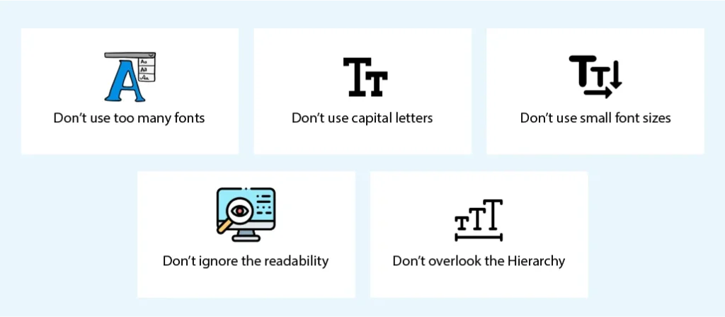
Don’t use too many fonts
Using multiple fonts in a design creates inconsistency. This makes the content look unprofessional. In fact, too many distinct font styles can be distracting. This way, users won’t be able to focus on the message. At max, use no more than three different fonts.
Don’t use capital letters
Capital letters can be used for emphasis. Yet, overusing them makes the text harder to read. There’s actually a rule that says using ALL CAPS means “shouting on the internet.” Capital letters are fine for headings and subheadings. However, you should avoid them for the body text.
Don’t use small font sizes
Generally, you should be using small font sizes for the body text. Yet, there’s a limit to how small it should be. A good option is to keep your font size between 11-13. For headings, sizes between 20-26 are excellent. Subheadings are usually in the middle.
Don’t ignore the readability
Typography may sound like it’s just about aesthetics. That’s far from the truth. Readability is another metric that you have to guarantee when delivering readable content. Use legible fonts and optimal spacing. Using easy words and appropriate contrast also helps.
Don’t overlook the Hierarchy
Of course, you can’t overlook the hierarchy when adjusting the typography hierarchy. However, it’s important that you avoid creating a weak one. A strong hierarchy strategy for text engages users and prioritizes important information.
Wrapping it up
Typography Hierarchy is all about creating balance and guiding the reader’s eye naturally. It helps convey the right information in a logical but aesthetic way. Good readability has the ability to convert users. Simple content with easy readability can actually increase user conversions by 30%.
At Linkitsoft, we understand that typography is more than just selecting fonts. We understand that it’s about creating a memorable reading experience. The aim is to enhance user engagement and retain them.
Get in touch with us and explore the creativity of hierarchy in typography. Our designers can create highly functional and aesthetically pleasing typography for your website. Whatever your design needs are, we’re here for you!


