Ever stared at a messy UI and thought, “There has to be a better way to keep everything consistent”? In our genuine experience, we’ve seen that almost every UX designer has been there. UX/UI design might look fun to know, but we know it’s more technical than it seems.
You could be designing your first app. Or maybe you are managing an extensive design system. Whatever you’re doing, maintaining consistency in user experience can feel impossible at times. That’s where a UX style guide swoops in. It’s like a superhero with a grid system and color palette in hand.
Yes, just imagine. This style guide really is the superhero. If you’re confused about the UX design system, you’re at the right place. In this guide, we’re diving into the why, the how, and the oh-so-important details of building a UX style guide.
We’ll explore why they not only keep your designs on point but also make your life (and your team’s life) a whole lot easier. So… let’s get started then!
What is a UX style guide?
What did people do all those centuries ago when there was no GPS? They used to travel at night, following the beautiful night sky. But wait… how did they do that? Well, they followed the brightest star in their night sky. You can still see it today. It’s known as the North Star.
Now, a UX style guide is like that north star for your product’s design. It’s there to help you find your way around your product’s user experience. It ensures that everything from your typography to tone feels consistent. It helps your design look intentional and user-friendly.
A UX style guide is not just a collection of pretty colors and fonts. It’s a living document that combines all the visual and experiential elements that shape how users interact with your product.
Just Imagine this: you’re working with a team of designers and developers. Writers are also present, spread across different departments. Without a style guide, everyone has a different interpretation of “what looks good.”
It would basically just spiral into a mix of mismatched buttons, off-brand colors, and inconsistent messaging. However, a UX style guide solves that problem. It lays down the groundwork for how things should look and behave.

What Are the Benefits of Having a UX Style Guide?
So, no matter who’s designing a new screen or writing a new feature description. Thanks to our UX guide, everything feels cohesive and on-brand. It’s basically your design team’s best friend. Or, you could look at it as your product’s secret weapon to deliver a smooth user experience. So, the benefits are vast.
- Every part of your product looks and feels like it belongs together. This boosts user confidence and trust.
- No more guesswork. Designers and developers can move quickly. Of course, they’ll be following clear guidelines.
- Everyone speaks the same design language, thanks to the guide. This means fewer misunderstandings and more productivity.
- New designers or devs can jump in without feeling lost. Naturally, they’ve got a handy guide to follow.
- As your product grows, your style guide keeps everything in check. This prevents big drifts in design styling.
- A unified design strengthens your brand’s visual identity. It even helps it stand out in the market.
- With the right rules, you ensure your product works well for everyone. This way, everyone loves it.
What should a UX style guide contain?
So, you’re getting ready to build a UX style guide. That’s amazing. But wait, what exactly goes into it? Well, you can think of it as your design team’s playbook. It would be one that covers everything. Think from the visuals to the vibe.

It’s not just about making things look good; it’s about creating an intuitive user experience. You’ll find this across your entire product. Your style guide acts as a foundation no matter what you’re designing. It keeps everything consistent and aligned with the brand. Let’s break down the essentials that make it all come together:
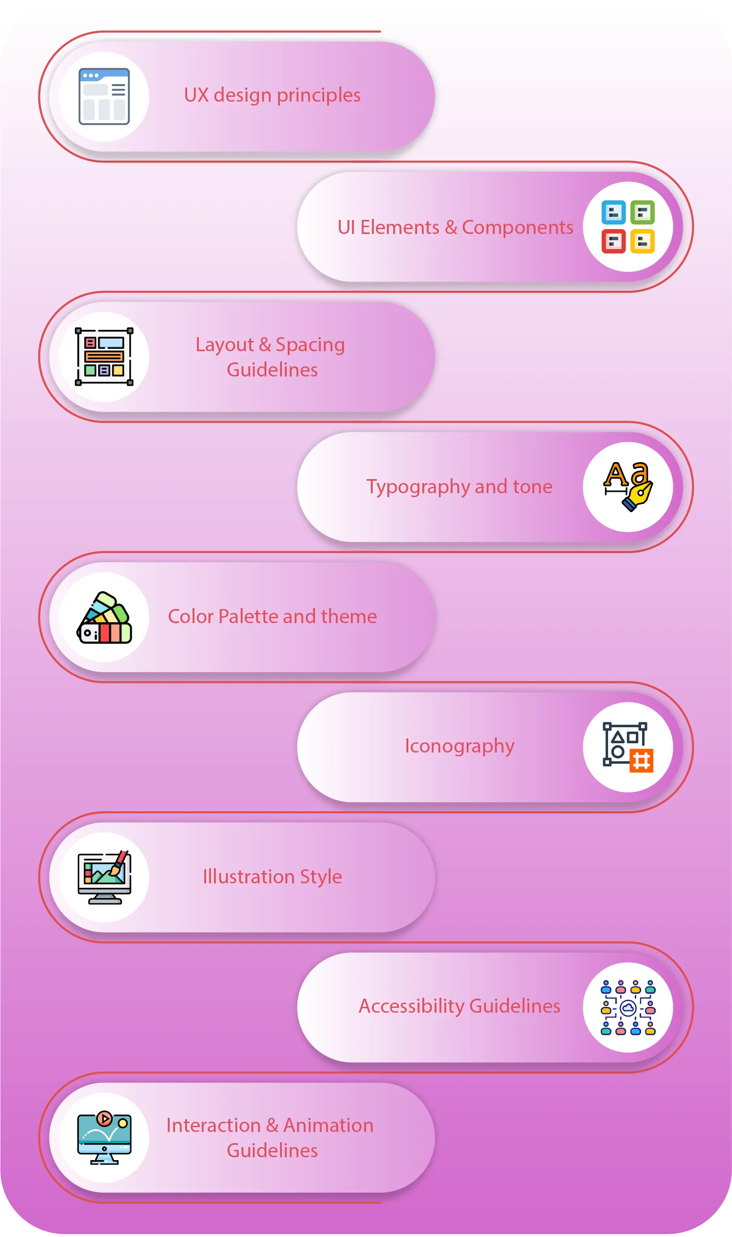
1. UX design principles
These are the foundations of every design decision. UX principles guide the overall approach you take when designing. They help make sure that every element, feature, and interaction is rooted in a user-centered mindset. They help keep your team aligned on what matters most.
Key focus areas:
- Simplicity over complexity
- Clarity in navigation and actions
- Consistency across the entire experience
- Accessibility and inclusivity for all users
- Empathy-driven design choices
Following the UX design principles can help you get a basic idea of how you design. Along the way, you’ll discover that they’re actually very beneficial. This is why they must be an important part of your UX style guide.
2. UI Elements & Components
This section outlines all reusable elements in your design system. From buttons to forms, having a consistent look and feel across these components makes your product intuitive and scalable. Users feel more comfortable when you have a consistent design across your product.
This includes:
- Button styles (primary, secondary, disabled, etc.)
- Form elements (input fields, checkboxes, radio buttons)
- Navigation elements (menus, tabs, breadcrumbs)
- Cards, modals, accordions, and sliders
- States (hover, active, disabled, focus)
Just think of how weird a product would look without the right UI elements. If you don’t check properly, these components will look inconsistent. A brand that doesn’t look consistent starts looking suspicious pretty quickly.
3. Layout & Spacing Guidelines
A clean layout isn’t just about aesthetics. Before that, it’s about usability. Proper spacing and alignment ensure that content flows well. This helps it feel balanced, and it’s easy to navigate. Easy navigation helps users feel more comfortable when using your product.
Covered areas include:
- Grid systems (e.g., 12-column, flexible grids)
- Standard margins and padding
- Alignment rules and spacing ratios
- Responsive layout behavior across devices
- Safe zones and visual hierarchy
Misaligned or irregularly placed objects can look weird. Even asymmetry follows a pattern. There needs to be optimal spacing between objects. 90% of users have stopped using an app at some point due to poor performance. This happens when the layout and spacing do not load properly.
4. Typography and tone
Typography does more than display words—it sets the tone for your entire brand. Paired with tone guidelines, it helps ensure that your messaging feels consistent and reflects your brand’s personality. This gives a good sense of customer representation.
Guidelines should specify:
- Font families and usage scenarios
- Font sizes, weights, and line heights
- Heading hierarchy (H1, H2, H3…)
- Tone of voice for UI copy (friendly, professional, quirky, etc.)
- Examples of error messages, success prompts, and CTAs
Using the right fonts and sizing can actually improve the user experience by up to 40%. This could mean some extra conversions, too. When users like what they see, they want to purchase, too. Users only read 20–28% of the text on a page. They usually skim. Yet, the way it is displayed in typography makes a huge difference.
5. Color Palette and theme
Color plays a major role in emotion and usability. Your palette should be both visually appealing and functional across light and dark modes, accessible themes, and brand variants. It should align with your brand’s image, too.
This section includes:
- Primary and secondary colors
- Accent, neutral, and background colors
- Color usage rules (e.g., what to use for alerts, links, buttons)
- HEX/RGB/CMYK values
- Contrast guidelines for accessibility
Every color palette and theme has its own vibe. Think of a grunge theme for a sports drink website. Now, imagine a dreamy theme for a skincare website. Isn’t it amazing how these aesthetics just popped into your mind?
6. Iconography
Icons are small but mighty—they simplify communication, add clarity, and reduce cognitive load. Consistency in icon style ensures they blend seamlessly into your design. Icons do play a big role. They even work as a recognition.
What to include:
- Icon style (line, filled, outline, monochrome, etc.)
- Sizing and scaling rules
- Icon padding and alignment
- When to use icons with/without labels
- Downloadable icon libraries or links to sets
Remember how Windows 95 icons used to be? They were a whole different vibe that we still can’t forget. Yeah, that’s the kind of impact Icons have on our minds. The UX process needs to be detailed.
7. Illustration Style
Illustrations can add warmth and personality to your product, but they should always support the content, not overshadow it. This section helps ensure illustrations stay aligned with your brand’s vibe. Think of how certain images stir specific emotions.
Key points to include:
- Illustration types (flat, isometric, 3D, abstract, etc.)
- Color treatment and shading rules
- Consistent line weights and shapes
- Placement recommendations (onboarding screens, empty states, etc.)
- Examples of dos and don’ts
Illustrations often bring a blog post or web page to like. As an example, look at the illustrations in this guide. It’s part of the UX/UI design. These illustrations aren’t doing much, but they resonate with you. They’re a part of your user experience.
8. Accessibility Guidelines
Designing for inclusivity isn’t just an option. It’s essential. Everybody deserves access to your product. No matter their background. Accessibility standards ensure your product works for everyone. This is regardless of their abilities or device.
Your guide should cover:
- Minimum color contrast ratio
- Alt text rules for images and icons
- Keyboard navigation support
- Screen reader compatibility
- Focus indicators and tab orders
The UX process should always include accessibility guidelines. So make sure your UX style guide covers this. The more people your product is available to, the more diverse it is. Don’t you want everyone to be able to access your digital product?
9. Interaction & Animation Guidelines
Animations and interactions can make your UI feel alive and intuitive—but only when used thoughtfully. This section sets boundaries and best practices so interactions enhance, not distract. Too many interactions are never good.
Covered elements:
- Hover, focus, and active states
- Loading animations and micro interactions
- Timing and easing standards (e.g., ease-in-out, 200ms)
- Motion principles (e.g., subtle, responsive, purposeful)
- When not to use animations (e.g., for accessibility reasons)
Think about a website that has a character that runs throughout the web page when you scroll. Sure, it sounds fun. Yet, it will easily distract you from your main objective. You will just play it like a game. The reason you were there would just fade away.
How do you create a UX style guide?
Creating a UX style guide might sound like a huge task. It actually is, too. But once you break it down into steps, it becomes structured. You’ll even find it to be a fun process. It’s not about perfection. It’s about building a foundation your entire team can work with. Here’s how to get started:

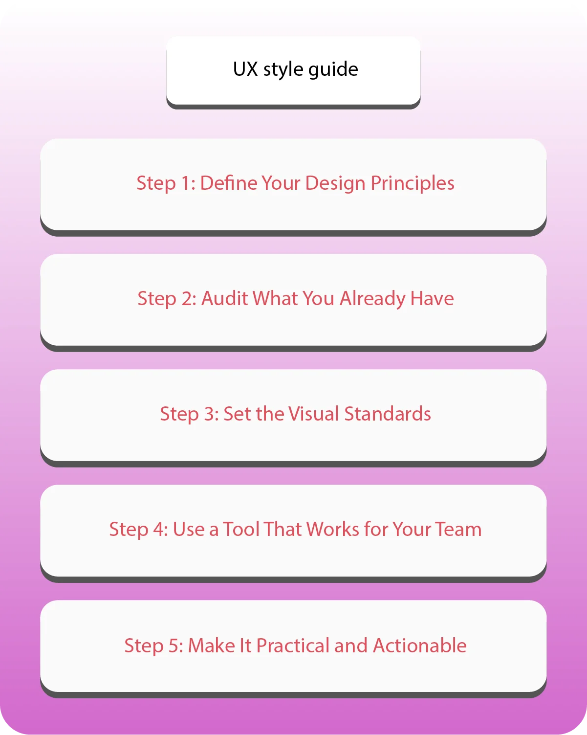
Step 1: Define Your Design Principles
Start by laying down the core principles that will guide every design decision. Think of these as your brand’s design values. They should reflect both what your users need and what your brand stands for.
Ask yourself:
- What do we want users to feel when using our product?
- Are we aiming for simplicity, playfulness, professionalism—or all three?
- What values should always show up in our UI?
Step 2: Audit What You Already Have
So, you’re aiming to reinvent the wheel. So, take a good look at your existing designs first. What’s working? What feels inconsistent? Conducting a UX audit helps you identify patterns and gaps. You’ll find opportunities to improve.
Things to review:
- UI components across your product
- Typography and tone of current content
- Color usage and inconsistencies
- Interaction patterns and layouts
Step 3: Set the Visual Standards
Now it’s time to document the visual side of things—this is where the real building begins. Define your brand’s design language so that everyone on your team knows exactly what to use and when.
Include clear rules for:
- Typography (fonts, sizes, weights, usage)
- Colors (primary, secondary, accent, accessibility contrast)
- UI components (buttons, forms, icons, cards)
- Layouts and grids
- Spacing and alignment
Step 4: Use a Tool That Works for Your Team
The best UX style guide is the one your team can actually use. It could even be a simple PDF. Just choose a format that’s easy to access, update, and collaborate on. Remember that you’ll have a whole team focusing on this.
Here’s what you should do:
- Keep everything organized with folders or sections
- Use visuals and real examples—don’t just write rules
- Make it easy to search and navigate
- Write clearly, don’t confuse
Step 5: Make It Practical and Actionable
A UX style guide should be more than a document—it should be a tool your team uses every day. That means it needs to be practical, not just pretty. Think Notion or Obsidian; these could be very useful tools. It’s only helpful if your team is familiar with them.
Make it work by:
- Including examples of good vs. bad usage
- Adding “when to use this” notes for each component
- Keeping the language simple and direct
- Updating it regularly as your product evolves
How can Linkitsoft help create the perfect UX style?
A UX style guide is more than just a bunch of documents. It isn’t just limited to some points. Designing a user experience isn’t as easy as it seems. It takes a lot to understand what your users actually want. Then, you also have to align it with the brand image. There are other aspects that you have to look out for, too.
It is a complex process, but with the right team by your side, you can create impacting UX designs. Are you confused about finding that team? Well, you genuinely don’t have to be. Linkitsoft is here for you. We’ll help you build that UX style guide, and we’ll be ready to work with you.
3 out of the 12 reasons why projects fail are connected to user experience failures. It matters more than you think. Perfecting it can be a hassle without the right expertise. So think it through and choose your team wisely.
Let’s style and launch
Hopefully, you’ve got a general idea of how to make a UX style guide. If you’re still confused, it’s okay. We’ll help you decide. At Linkitsoft, we specialize in turning scattered design ideas into structured UX systems. Our team dives into your product and goals. We truly understand your audience to build a UX style guide.
So it’s not just pretty on paper, but it’s powerful in practice. Our development team is also skilled. They know how to make a product work exactly as you imagine. Even though the UX is more a part of the front-end development, our back-end developers are no less. So, you’ll get a whole team that can make your product look amazing.
Let’s connect then. We’ll collaborate and create impressive designs that will keep users engaged. Our clients are more than just customers. We treat them like our partners. We’d love to see their success. So, what are you waiting for after all? Let’s get started!


