
Imagine this: you’re a designer starting your first day at a fast-moving startup. You open their design files, and it’s chaos. It feels like walking into a room where every chair is a different color, the walls all clash, and the lights keep flickering. Nothing matches. Buttons come in all sizes. Colors don’t work well together. The fonts look like five people picked them without ever talking.
Right away, you know this team needs a UI style guide.
Think about Spotify. Their UI style guide stands out. It’s fun, bold, and full of energy. But even more, it mixes clear design rules with just enough room for other developers to play. Their use of fonts and colors is spot-on. Plus, they show real examples—what works and what doesn’t when using UX parts. Their clean, sharp look didn’t happen by luck. It’s based on a simple, focused design that makes everything feel easy. And yes, they use Figma too, for both design and testing.
Now, let’s say your team uses Figma as well. With that, your UI style guide becomes more than just a file. It turns into a live, growing tool. It fits right into your design process and makes testing fast and easy. You can show ideas quickly, work with developers better, and make sure every design choice helps build a stronger product.
But why does this really matter?
Without a UI style guide, your product might turn into a patchwork mess—pieces that don’t work well together. That confusion makes things hard for users, slows down teams, and weakens the UX. However, with a guide that lives inside tools like Figma, your designs aren’t just pretty—they’re useful. They speak clearly. They get the job done.
This guide isn’t just about making things look nice. It helps your whole UI and UX system run better, faster, and smoother. And when that happens, users notice.
What Exactly is a UI Style Guide?
A UI style guide is a full document that explains how your product should look and feel. It lays out all the visual and interactive rules for your UI. You’ll find colors, layouts, and more. And it plays a big part in how your whole product feels and works. But it’s not just a rulebook—it’s your design blueprint. It helps you keep everything consistent, whether you’re building a website, an app, or a full dashboard.
This guide often includes major UX parts, like buttons, forms, and card layouts. It also covers font choices, spacing, icons, and how to use grids. Think of it like a cookbook but for design. Whether you’re wireframing, designing in Figma, or doing full mockups, a good UI style guide keeps your work neat and your UX strong.
Many people mix up a UI style guide with a full design system. And while they work together, they’re not the same. The style guide focuses on how things look, like fonts, colors, and UI parts. A design system goes wider. It includes the style guide, plus UX elements, design rules, and even code standards. So, a UI style guide sets the visual tone inside a much larger design plan.

Now, let’s look at what happens when teams skip the UI style guide:
- Inconsistency: Without clear rules, font sizes, button styles, and colors change all over the product. That gives users a messy and confusing experience.
- Inefficiency: Teams waste time re-creating the same UX pieces instead of using ready-made styles. This is especially true when working in Figma.
- Brand Dilution: When your look is all over the place, people don’t trust your brand. A simple, clean design can solve that. It helps keep things clear and easy to follow.
- Collaboration Friction: If no one has a shared guide, people get confused. This slows down design and causes miscommunication. But a good UI style guide brings everyone together designers, developers, and others—so work flows better.
So, here’s the bottom line: if you want a strong, scalable UI and UX, you need a UI style guide. It helps teams use the right fonts, build smart UX parts, and follow a clean, simple style. And when it’s made in tools like Figma, it’s even better. It has become a live tool that you can update anytime. That way, your designs stay sharp, your tests move fast, and your product UX just keeps getting better.
What are the Key Benefits You Can’t Ignore?
Creating a UI style guide might take time at first, but it really helps later. It supports every step in building a clean, easy-to-use product. When you use tools like Figma with neat UX parts, you set up a strong design base. It’s a smart move that pays off in many ways. Here’s why it matters:

Boosting Design & Development Speed
A UI style guide clears up any confusion. Designers don’t have to guess. They can use ready-made UX parts. Developers can look up styles right inside Figma, which makes the handoff smoother. What’s more, using the same patterns and fast mockups saves a lot of time. Studies show that teams with good style guides can cut design time by up to 33%. They can also reduce development time by 20%. So, when design and code teams use the same guide, everyone works faster and better.
Achieving Pixel-Perfect Consistency Across Platforms
It doesn’t matter if your product is on the web, iOS, or Android. A good UI style guide keeps the look and feel the same. You get matching buttons, fonts, and spacing across every screen. Whether you’re laying things out in Figma or testing in code, the design stays steady. Using the same clean and simple style also keeps the design neat and not messy.
Strengthening Brand Recognition and Trust
When you stick to the same colors, fonts, and UX parts everywhere, your brand becomes easier to spot. Think about Spotify. Their bold fonts and bright colors make the app stand out. That’s the power of a clear UI style guide. It helps your brand feel strong and trusted. And with Figma helping you stay visually consistent and quick to build, your product looks sharp and well-made.
Streamlining Collaboration and Onboarding
A UI style guide helps more than just designers. It also helps developers, product managers, and even new hires. New team members can read the guide and quickly learn how your design works. They’ll understand what UX parts to use and how things should look or move. Plus, with Figma, everyone gets updates in real time. That cuts down on confusion and makes mockups easier. This way, all teams work better together and build a stronger product from day one.
Elevating the Overall User Experience
When things look the same on every page, users feel more at ease. They see the same buttons, fonts, and layout logic. So, they know how to use your product without thinking too hard. A clear UI style guide makes this possible. It keeps the design simple and avoids extra clutter. And by using Figma to test and try ideas, you create a smooth and fun experience in the end. The best part? Users stay longer and like the product more.
What are the essential building blocks of a powerful UI style guide?
A strong UI style guide has three big parts: base elements, main UX pieces, and extra elements. Whether you use Figma, build a website, or make a mobile app, these parts help your team stay on the same page. They also make your product easier and better to use. Now, let’s break each part down.

Foundational Elements
Brand Identity Cornerstones
Your style guide should match your brand’s look and feel. Be sure to include:
- Logo Use: List the sizes and space around it, and how it can change (like color or black and white).
• Mission/Value Match: Use a design that fits your brand’s values. For example, a fun brand might use round fonts and bright colors, all while keeping a simple, clean style.
Defining Your Color Language
Colors show emotion and help people know what’s important. So, write down:
- Main Colors: These are your brand’s go-to colors (usually 2 or 3).
• Extra Colors: Use these for little pops of color.
• Neutral Colors: Use grays for background or text.
• Meaningful Colors: Like green for success or red for error.
• Accessibility Tips: Make sure your colors have enough contrast. Tools in Figma can help check this while designing.
Mastering Typography
Fonts help people read and understand your content. Be sure to define:
- Font Types: Pick 1 or 2 (like Roboto for text and Montserrat for headings).
• Font Order: Say what size to use for headings (H1 to H6), body text, and captions.
• Spacing Rules: Keep enough space between lines and letters (try 1.5x line height).
• Web Fonts: Use fonts that load fast and work well on the web, like Google Fonts.
• Mixing Fonts: Don’t use fonts that clash. Try pairing a sans-serif with a serif. This helps text flow better and makes your product easier to use.
Structuring with Layout & Grids
Grids bring order to your layout. Make sure to include:
- Spacing Units: Use the same sizes (like 4px, 8px, 16px).
• Screen Breakpoints: Say when the layout should change (like 320px for phones, 1200px for desktops).
• Flexible Grids: List how many columns and the space between them for each screen size. Grids help build a clean look that works on any screen.
Universal Language: Iconography
Icons make things easy to understand. In your guide, explain:
- Style: Say if they are outlined, filled, round, or sharp.
• Sizes: Use set sizes (like 16px or 24px).
• Where to Use: Like for menus or actions. Figma lets you test icons early in the design process.
Core UI Components (with States & Usage)
Buttons
Buttons let users take action. Include:
- Types: Primary, secondary, and tertiary.
• Button States: Like default, hover, clicked, disabled, or loading.
• How to Use: For example, use the primary one for main actions.
• Accessibility: Make sure each button works with keyboard and screen readers. Buttons are key parts of any style guide.
Forms & Inputs
Forms collect user info. Your guide should include:
- Input Fields: Like text boxes, big text areas, and labels.
• Other Controls: Like dropdowns, checkboxes, and radio buttons.
• Message States: Show success, error, or warning messages.
• Accessibility: Add clear error messages and keyboard access. These parts need testing in Figma to be sure they work well.
Navigation Elements
Menus help users move around. Be sure to list:
- Menu Types: Like top bars, side menus, or hamburger menus.
• Other Tools: Breadcrumbs, tabs, or page numbers.
• When to Use Each: For example, when should you use tabs instead of menus? These tools guide users and should be part of your style guide.
Information Displays
These show content. Include:
- Cards: Use these to show previews or short info.
• Pop-Ups and Alerts: Like tooltips, modals, and toasts.
• Tables: Best for data-heavy screens.
• Accessibility: Make sure modals can be closed with keys, and alerts are easy to see. Test these in Figma as you design.
Supporting Elements
Imagery & Illustration Guidelines
Pictures and drawings tell your brand story. Write down:
- Style Choices: Do you use photos, drawings, or both?
• How to Use Them: Like in hero sections or banners.
• Where They Come From: Stock or made just for you.
• Speed Tips: Use small file types like WebP and compress them. Images help tell your story and should match your clean design.
Voice & Tone
Your words show your brand’s vibe. Explain:
- Tone Style: Are you friendly, pro, or playful?
• Examples: Like button labels (“Get Started” vs “Let’s Go!”).
• Consistency Rules: Make sure all text matches your brand feel. Voice and tone are big in UX and should feel right for your users.
Motion & Animation Principles
Little motions give helpful feedback. Include:
- Page Transitions: Like smooth fades or slides.
• Action Feedback: Like spinners or button hovers.
• How to Use: Keep it simple so users don’t feel overwhelmed. These soft movements match a clean style and can be tested in Figma.
How Do You Craft a Perfect UI Style Guide That Works?
If you want a simple plan for building a UI style guide, you’re in the right place. Just follow these eight steps. They work great for any product, UI, or UX team—especially if you’re aiming for a clean, simple design.
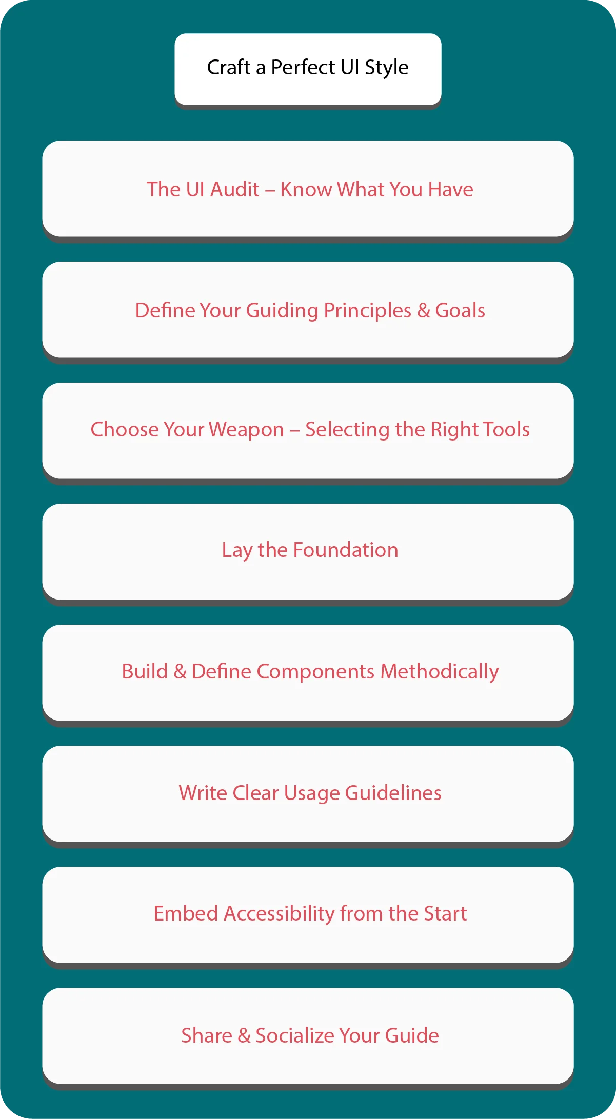
The UI Audit – Know What You Have
Start by checking what you already use in your UI:
- List Everything: Write down your colors, fonts, buttons, and layouts.
- Spot Issues: Look for things that don’t match or repeat for no reason.
- Use Tools: Try Figma’s “Inspect” or your browser’s dev tools to check styles while prototyping.
This step shows you where you stand and what needs fixing.
Define Your Guiding Principles & Goals
Now, figure out why you’re making this guide:
- Pick Your Values: Maybe you care about “clarity over decoration” or “accessibility first.” These help you stick to a minimalistic design style.
- Set Goals: Do you want to make designs faster? Or keep things consistent? Or improve how users feel?
- Ask Around: Talk to designers, developers, and product managers. Make sure everyone agrees on the goals.
When everyone’s on the same page, things run smoother.
Choose Your Weapon – Selecting the Right Tools
The right tools make everything easier:
- Figma: Great for working as a team, building designs, and sharing UI parts.
- Sketch: Works well for teams using Macs.
- Other Tools: Try Zeroheight or Frontify to keep your guide up to date and easy to share.
Each tool has pros and cons. Figma is great for teams, but not perfect for docs. Zeroheight is amazing for devs, but it takes time to learn.
Lay the Foundation
Next, build the base of your guide:
- Colors: List your hex codes and RGB values. Explain where and how to use them.
- Typography: Choose your fonts, sizes, and how you’ll use them in order.
- Spacing: Use a simple scale, like 8px steps, for clean layout rules.
- Organize It: Make a board in Figma or a section in your doc with all these parts.
This part sets the tone for your entire style.
Build & Define Components Methodically
Now it’s time to build your UI blocks:
- Start Small: Buttons and form inputs are a good place to begin.
- Add States: Show every state, like hover, click, or disabled.
- Use Variants: In Figma, group different versions of a component. This helps when prototyping fast.
- Test Everything: Try your components on different screens. Make sure they work everywhere.
Clean, simple parts make your product better and easier to use.
Write Clear Usage Guidelines
Make rules for using your UX components the right way:
- Do’s: Say things like “Use primary buttons for main actions.”
- Don’ts: Say things like “Don’t use red buttons unless it’s for an error.”
- Show Examples: Add pictures from Figma to make things super clear.
This helps avoid mistakes and keeps everything on-brand.
Embed Accessibility from the Start
Everyone should be able to use your product. So add accessibility early:
- Check Contrast: Use tools like Stark to check color contrast. Make sure it meets standards.
- Focus States: Let users see where they are on the page when they use a keyboard.
- Code Right: Give developers tips on using ARIA and proper HTML tags.
- Add Alt Text: Make sure images and icons have text that describes them.
Accessible design helps everyone—and it’s the right thing to do.
Share & Socialize Your Guide
Don’t let your guide gather dust—share it:
- Show It Off: Host a workshop to explain why the guide matters.
- Give Access: Use tools like Figma or Zeroheight to let people view it anytime.
- Ask for Feedback: Let the team share ideas and ask questions. Update the guide as needed.
The more people use it, the better your UI will become.
What Should You Do After Creating a UI Style Guide?
A UI style guide is not something you finish and forget. It grows with your product.
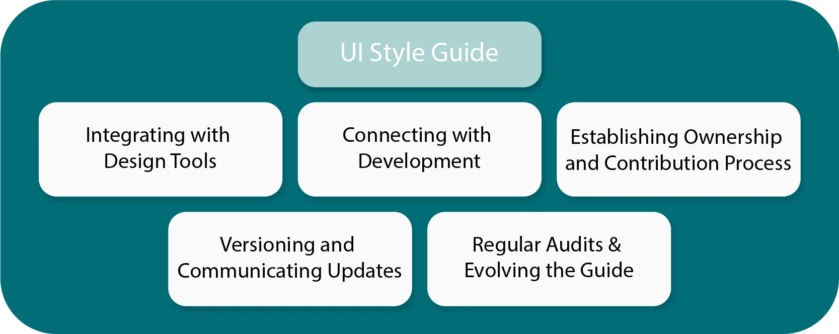
Integrating with Design Tools
Make sure your guide fits into the tools your team uses:
- Figma Libraries: Save all your UX components in one place so your team can reuse them.
- Design Tokens: Create tokens for your colors, fonts, and spacing. These help you sync design with code.
This keeps everything connected and consistent.
Connecting with Development
Bridge the gap between design and code:
- Use Handoff Tools: Zeplin or Figma Dev Mode helps share exact specs.
- Add Docs: Platforms like Storybook or Zeroheight help link designs with real code.
- Share Snippets: Add code (CSS, React, HTML) for components. This saves time when building.
Good handoffs make developers happy—and that means better products.
Establishing Ownership and Contribution Process
Someone has to take care of the guide:
- Assign an Owner: Pick a senior designer or lead to manage it.
- Create a Process: Let people suggest changes using tools like GitHub.
- Write the Rules: Say who can edit the guide and how to approve updates.
Clear rules keep things organized and fair.
Versioning and Communicating Updates
Track what changes and tell the team:
- Version It: Use numbers like v1.0 or v1.1 to show changes.
- Keep a Log: Write down updates like “Added new button style.”
- Notify the Team: Use Slack or email to keep everyone in the loop.
This helps your team stay current with design rules.
Regular Audits & Evolving the Guide
Keep your guide fresh:
- Run Audits: Check it every few months. Look for old or unused parts.
- Update Often: Change things when your product grows, Figma updates, or new design trends pop up.
A style guide that evolves with your product stays useful and loved.
There you go—a full guide on how to build and grow a UI style guide that actually works. It’s all about being clear, staying simple, and working together. Ready to build your own? Let’s get started.
Conclusion
Skipping a strong UI style guide isn’t just a small mistake. It means saying yes to messy designs, wasted time, and a weak user experience. And that choice can cost you both users and money. Without a clear UI style guide, your design becomes scattered. Your UX elements don’t match. Even your Typography won’t stay the same across different screens.
As a result, your team gets stuck in confusion, and you’ll waste time fixing the same problems over and over. Meanwhile, your competitors are moving faster. They use smart tools like Figma and follow clear style guides. Their guides cover everything UX elements, color themes, font rules, and how to test new ideas. This helps them build better products quickly and with confidence.
But here’s the good news—you don’t have to fall behind. At Linkitsoft, we create top-notch UI style guides just like the ones we’ve described. We focus on matching your UX parts, setting clear Typography rules, and building smart design plans that work. Our team uses Figma to make sure every part looks clean and feels right. We also stick to simple, modern styles that help users enjoy your product more.
What’s more, we don’t stop at just the look. We also improve how you test and build your product. This way, you work faster and smarter.
Choosing a less experienced team puts you at risk. You could end up with a style guide that doesn’t work. Then, you’ll be back in the same mess—slow progress, weak designs, and lost time. But with us, it’s different. We turn design mess into clear, easy steps. We make sure your UX is neat, your fonts are sharp, and your layouts stay clean—all inside Figma and following a sleek, minimal design.
So don’t wait for bad design to hurt your brand. Get in touch with Linkitsoft today. Let us build you a smart UI style guide that works. It’s time to bring order, speed, and style to your product—and we’re here to help every step of the way.


